My Custom Sports Card Creations

Mostly it was quality control. The set has also reached almost cult status for it's varieties and has gotten to the point where each card is heavily scrutinized. For example, some cards have a "missing period" variety in the third sentence on the back. Most of those don't really have a lot of collector appeal unless you REALLY like the set. There are a number of straightup errors and corrections (for example, one of the Joe Montana award winner cards has Jim Kelly's stats on the back...and there is a corrected version).

There are some really really popular varieties though. The two that come to mind are the Fred Marion card with John Taylor in the background with his belt unlocked (interesting visual result) and The Dexter Manley card that references his drug related suspension on the back (line removed really early in production).

Here's a good list: https://junkwaxgems.wordpress.com/2010/01/07/complete-1990-pro-set-error-variation-and-oddity-list/
junkwaxgems is a great informational website for errors of that era. I've been referring back to that site, for years. So much so that I have the site bookmarked.
 
Here's a couple more quick ones.

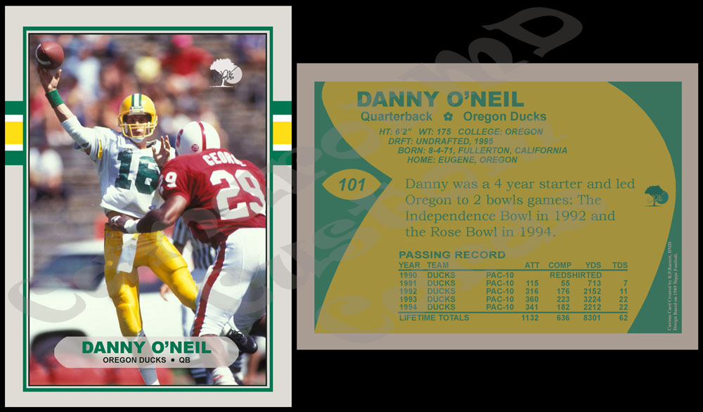
The first is another Danny O'Neil card. I have had this on my list for a while and I decided to send him a full set of the cards of him I had created. So, I pushed this one to the top of the list to include it.

#101 1989 Topps Danny O'Neil
ImRHzWb.jpg


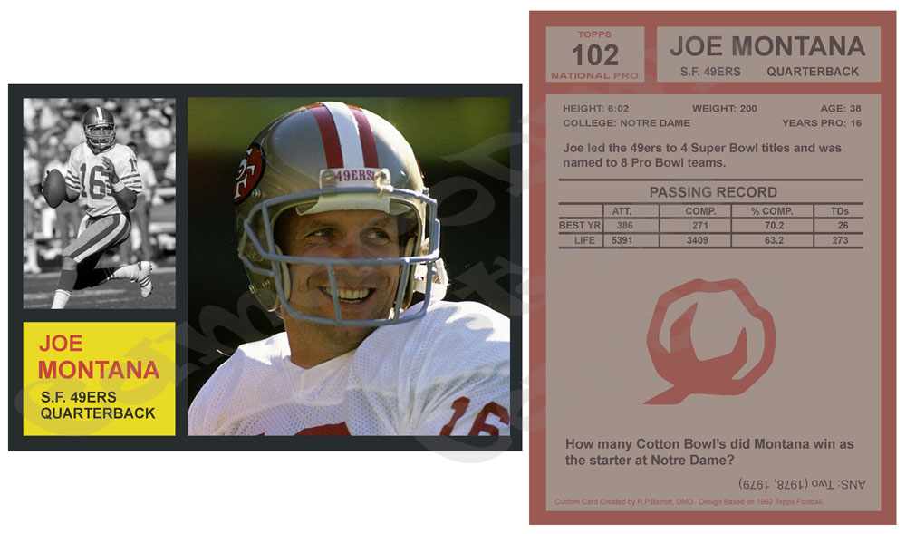
Up next is a card of my favorite player done in the design of one of the most popular vintage football sets.

#102 1962 Topps Joe Montana
z6O7GU3.jpg
Nice gesture sending Danny O'neil a complete set of his cards, that you have created. I'm sure that he will be impressed by the quality of the work, and the fact that he will have an entire set of his own cards.

Love the Montana card. Definitely one of the greatest players ever! Maybe this one should be listed on the junkwaxgems web site? As I don't see your logo:woot: is there another corrected version? Which variation is the short printed, hard to find chase card?;)
I hope he likes them. He was kind enough to sign one for me about a year ago and I just thought I should send him the whole group (I think there was 7 total).

I love the classic 1962 Topps design and a Montana sounded like fun. I wanted to do it because I found an interesting action photo of Montana a while back and thought this would be a good application. Montana always used that 2-bar facemask except for a very brief period in the 1980s. Sometime in 86 or 87 he had a 3-bar facemask...which to me looks really different on him. It always stood out to me. I have always noticed little details like that. Since I had the photo, I thought it would be fun to use it as the B&W photo of a '62.

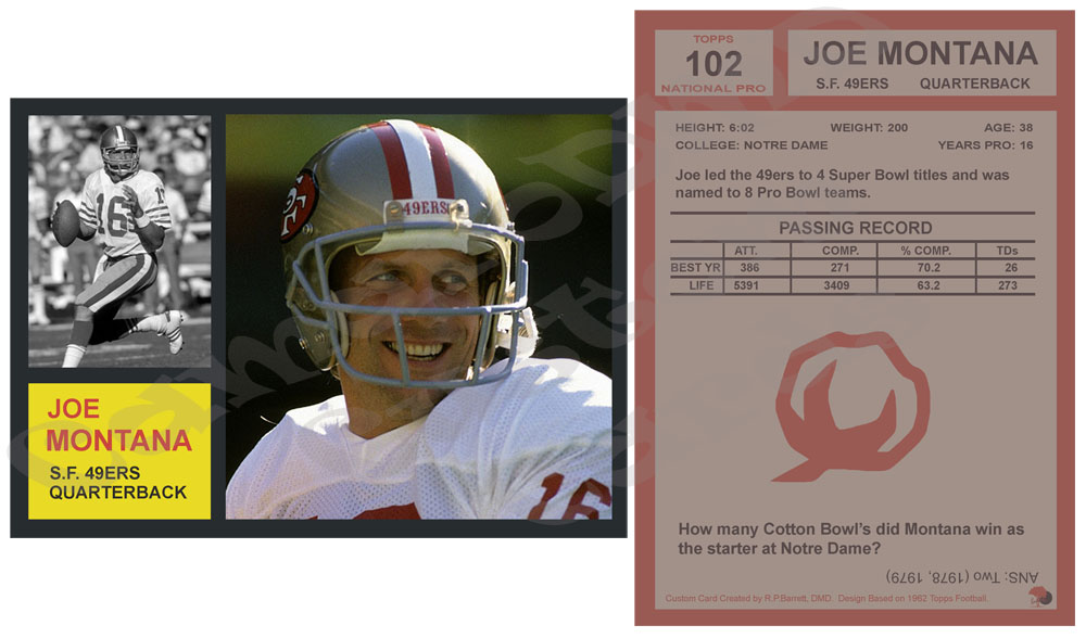
As for my logo...I didn't put one on this card. 1962 Topps didn't have any logos anywhere and I just couldn't find a spot where I liked it. I felt like it was sticking out too much. So, I skipped it on this one. Plus, I did this card this morning (it's a quick one) and didn't have time to mess around with the logo too much. I suppose I could have done it really small in the bottom right corner on the back. I might play with it more later.
 
Love the Montana card. Definitely one of the greatest players ever! Maybe this one should be listed on the junkwaxgems web site? As I don't see your logo:woot: is there another corrected version? Which variation is the short printed, hard to find chase card?;)
Gave it some thought and decided you are right...need to have the logo on it. I decided to put it on the back really small. So, here it is:

qJKie6p.jpg
 
...and suddenly the sun came out, and all is right with the world! :cigar: Hopefully, I should be able to rest easy tonight! :yawn:
 
...and suddenly the sun came out, and all is right with the world! :cigar: Hopefully, I should be able to rest easy tonight! :yawn:
LOL!

OK, here are a couple more that I worked on recently. Both are Oregon Duck QBs...one current and one former.

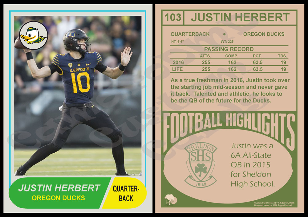
This first card is of the current Oregon QB and I think this kid is going to be really special. He's big, athletic and once he gets a little more refined I think he's going to be great. He has the potential to be a first round pick one day.

I have never done a card of a current NCAA player, but I thought he would be a good first choice. So, I did a card covering his first season (2016). I might continue the trend and make him an annual card.

#103 1968 Topps Justin Herbert
MkA2VSF.jpg


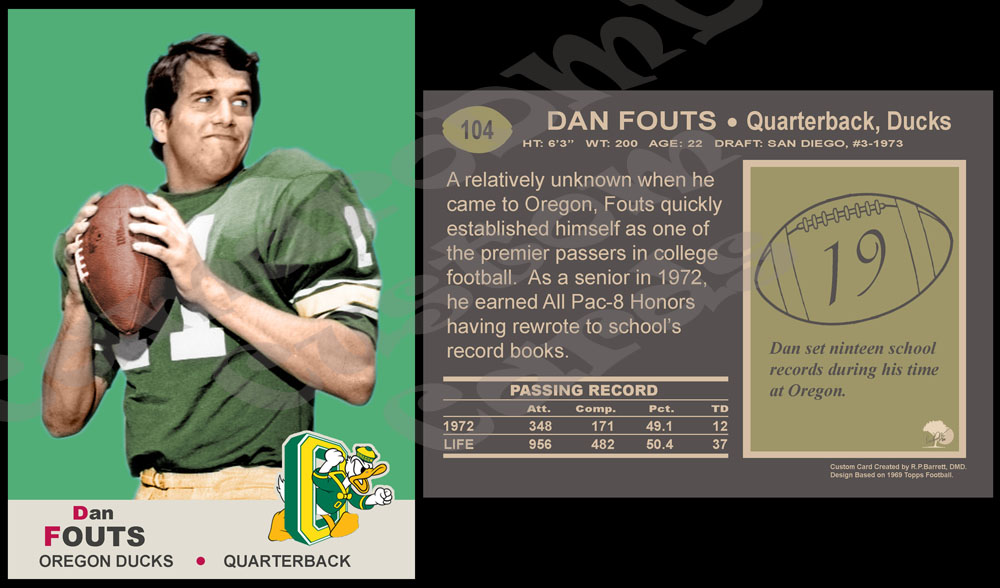
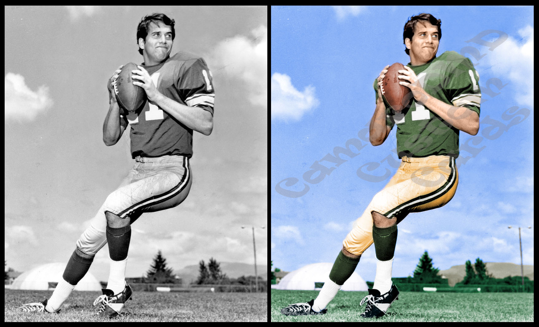
Up next is another classic Topps design featuring an Oregon QB...although a much older one. I have wanted to do an Oregon Dan Fouts card for some time but never found the right photo. The only decent photo I was ever able to find of him that would work was black and white...so I decided it was time to improve my colorizing skills. I have done one card in the past where I crudely colorized it...but I thought this was a good opportunity to really push those skills. The card design here was very easy, but the photo was the challenge.

I decided to do this card in design of 1969 Topps football. This card specifically models the series 1 cards which featured a colored boarder. I prefer the look of those verses the series 2 with the white boarder.

#104 1969 Topps Dan Fouts
Jmes5s3.jpg


Just for fun, here is the photo I used. Before and after:
ge9vxUg.jpg
 
I like them both, but I definitely lean hard to the Fouts card. Partially because I always liked Fouts. Partially because I really like the card design, and the bonus is the extra time and effort put into colorizing it.
 
OK, here are a few more that I finished up recently.

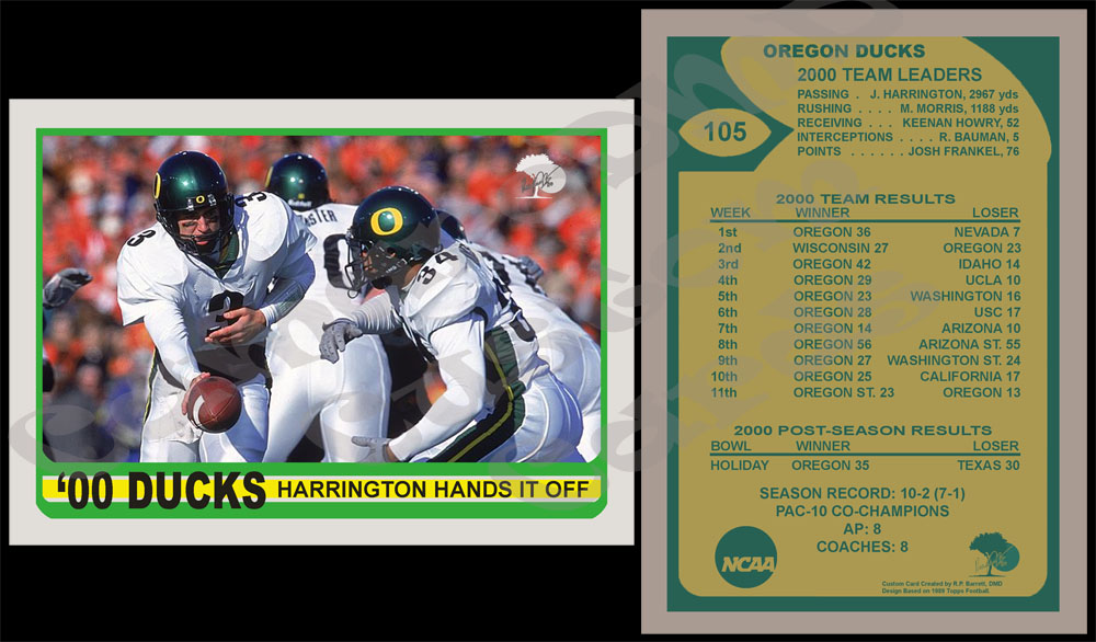
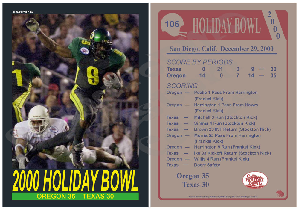
These first 2 continue my designs for the Oregon Ducks teams that I have grown up watching. These are for the 2000 season and its bowl game.

#105 1989 Topps 2000 Oregon Ducks
dpGgj1T.jpg


#106 1985 Topps 2000 Holiday Bowl
4xHNm5q.jpg


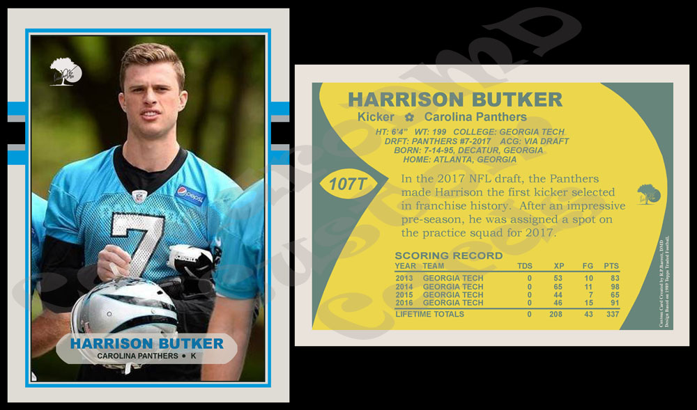
This next design is for a player that I had been really excited about. My Carolina Panthers have had Graham Gano as their kicker for a few years now and I just am not a huge fan. The guy can kick it a mile but his accuracy just doesn't seem to always be there. The Panthers had never drafted a kicker before and when they spent their 7th round pick this year on a really good one out of Georgia Tech I got very excited.

He had a good pre-season, good enough to where it looked like they might carry two kickers on the roster. Ultimately, they signed the rookie to the practice squad and I hoped he might still be the future. Unfortunately, injuries happen in football and the Chiefs signed him off the Panthers practice squad this last week. He made his NFL debut last night and kicked the game winning field goal on Monday Night Football. Not a bad way to start.

So, here's a card for him.

#107 1989 Topps Traded Harrison Butker

ltn63Qd.jpg
 
So, I have been busy with other things lately...haven't had a lot of time to do customs. But, I have had some projects on the back burner for a while and I thought I would share a sample.

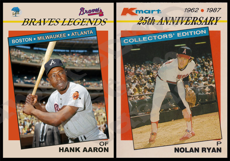
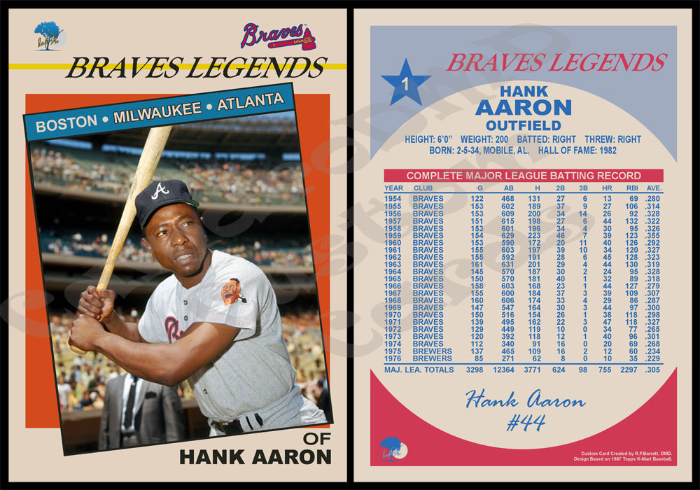
I'm a huge Atlanta Braves fan and have wanted to do an all-time greats fir the Braves set. So, I have started working on the design. I wanted to pick something a little different...but still something I liked. In 1987, Topps did a 25th anniversary set for K-Mart using baseball legends and I have always loved that set. So, I decided to do a Braves theme with that.

I finished the front of card #1 today and thought I would see what you guys thought. Not surprisingly, card #1 is Hank Aaron. Here it is next to the real Nolan Ryan from the K-Mart set.

4wQX5uS.jpg
 
Looks good. Nice touch listing all 3 cities the Braves have played in. I noticed the lettering for Boston is white, while the lettering for Milwaukee, and Atlanta are yellow. Was it planned, or just an oversight?
 
Looks good. Nice touch listing all 3 cities the Braves have played in. I noticed the lettering for Boston is white, while the lettering for Milwaukee, and Atlanta are yellow. Was it planned, or just an oversight?
That was planned...good spot though. The significance was going to become more apparent with future cards but since you caught it I will explain it now. On each card one or more of the cities' names on the front of the card will be outlined in black. In the case of card #1, it's Milwaukee and Atlanta. They are highlighted on this card because Hank Aaron played for the Braves when they were in Milwaukee and Atlanta.

Warren Spahn will be one of the early cards in this series as well. On his card Boston and Milwaukee will be highlighted. Spahn will either be card #2 or #3.
 
Nice subtle detail. Then I guess that would make Eddie Mathews card pretty special in this set. Since he was the only player to play for the Braves in all 3 cities.
 
So, it's been a while since I shared anything. I have been super busy with work, family, holidays, other hobbies, ect. and just haven't been doing customs lately. Here are a couple new ones.

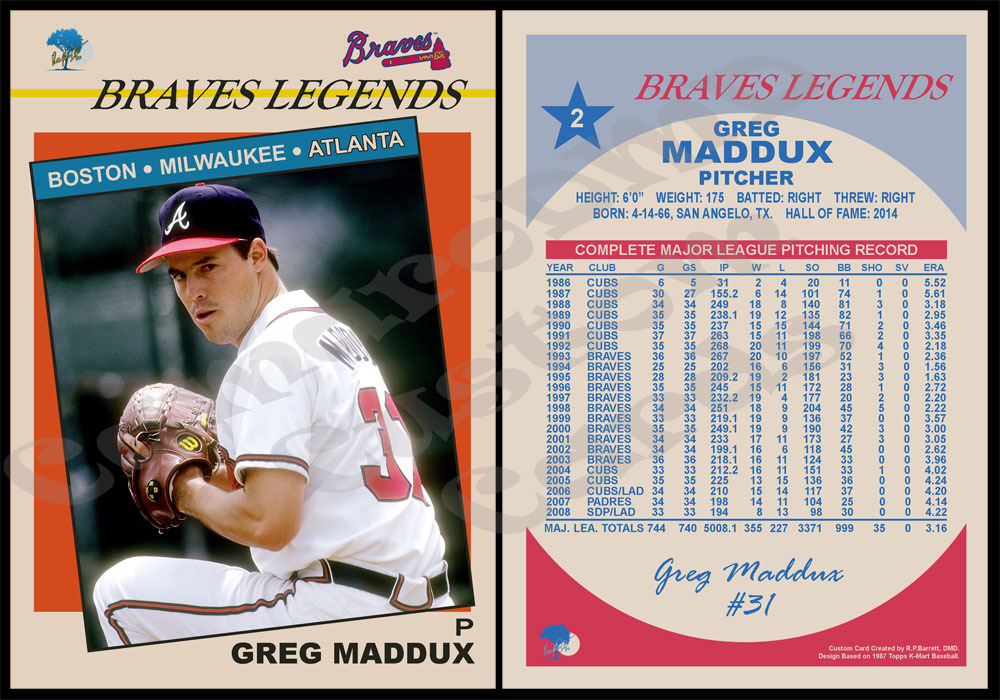
This first one I finished a while back but never posted. It's card #2 of the Braves set.

1987 K-Mart Braves #2 Greg Maddux
Nvnxv5t.jpg


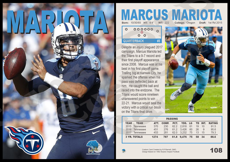
Up next is a card I did last night. I had a little time so I sat down and did a creation from a set I have never done before. As many of you know, I am a big Marcus Mariota fan. I have made an effort to make a custom "base" card after each one of his seasons. I did a 1989 Topps after his rookie year and a 1962 Topps after his second year. Here is my "base" card for his 2017 season.

#108 1992 Skybox Impact Marcus Mariota
FZEwxro.jpg
 
Back
Top