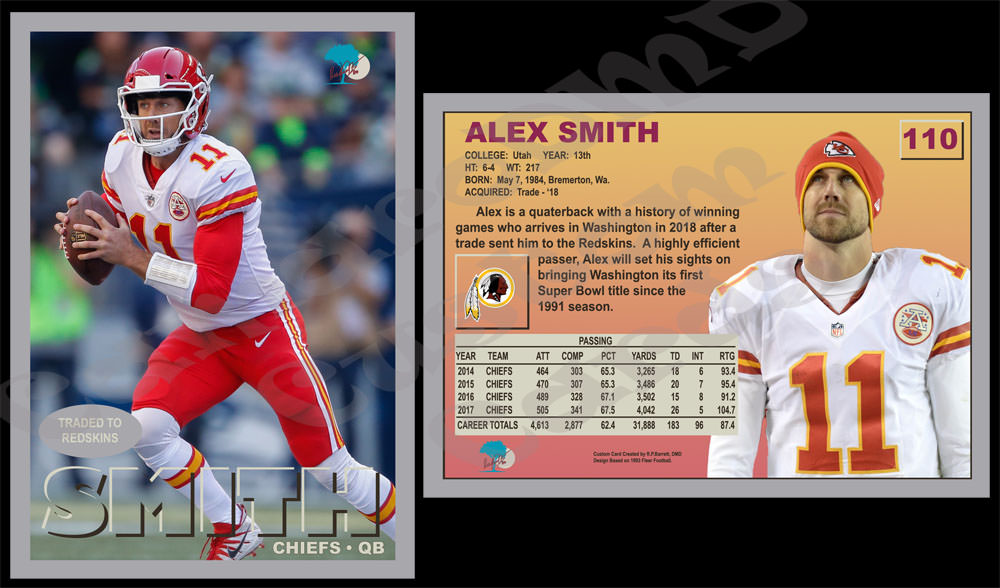
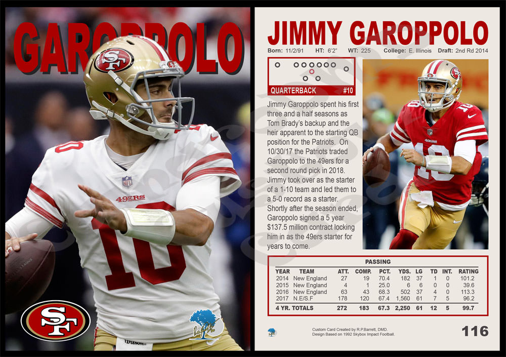
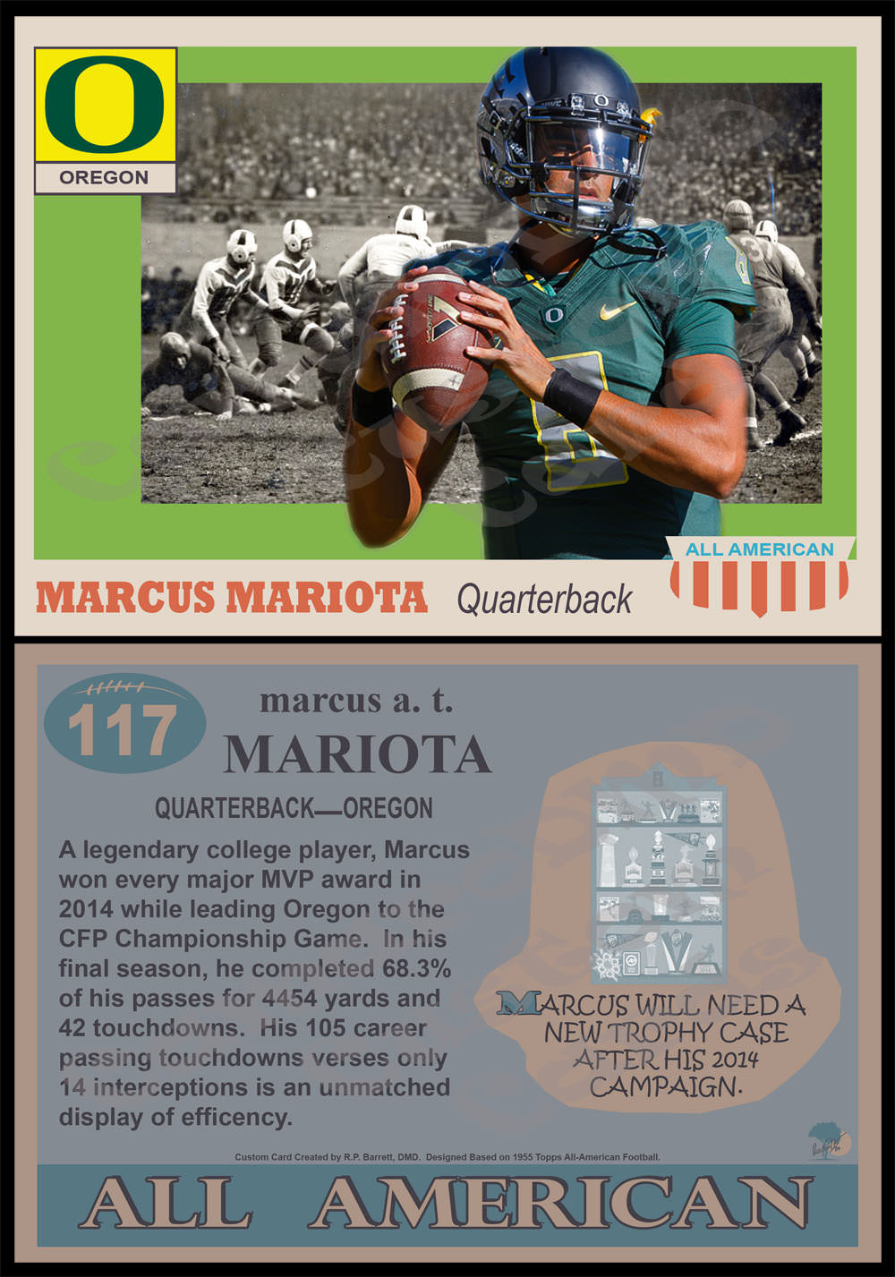
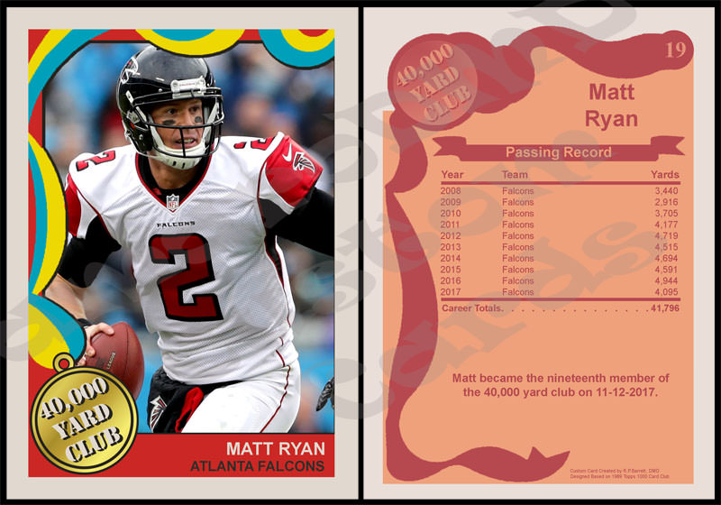
Looking good as usual! I noticed that you added your logo to the front of the Alex Smith card. Unless I missed one earlier, I believe this is the first time, isn't it? I also love the traded notation on the front, and the new team emblem(Redskins) on the back
Thanks!
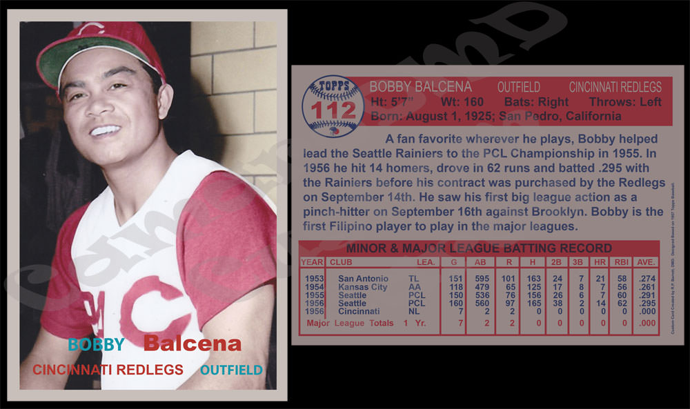
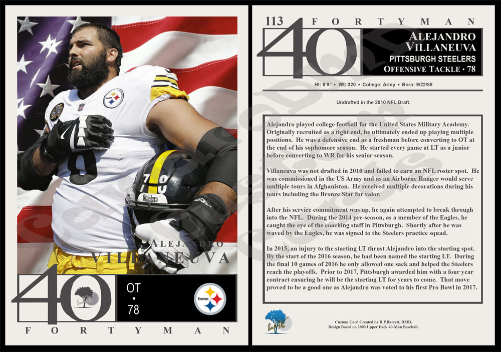
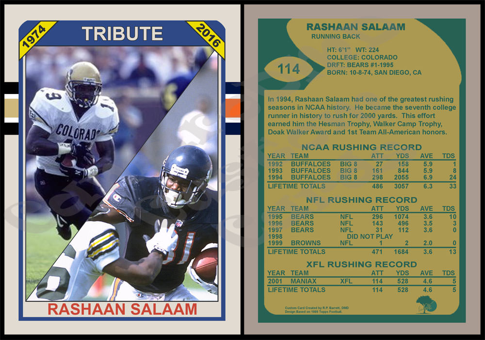
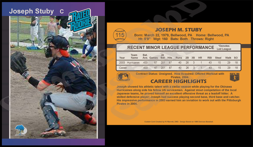
I have put my logo on the front of a handful of cards but not that many. A lot of the cards I do replicate vintage Topps cards and they tend not to have any logos on the front...so to keep in line with their simplistic designs I prefer not to. On newer design cards (where they had some kind of visible logo branding on the front) I do sometimes. If I can do it tastefully, I will add it.
As a few examples from the last couple pages:
#90 2008 UD Rickey Henderson has my logo on the front in silver in place of the normal UD logo. (This is the first card with it on the front, #86 is the first card I ever put it on at all).
#93, 101, 105, 108 are all 1989 Topps designs and have it on the front in white in place of the white Topps logo.
#99 1979 Topps Rickey Henderson has it on the front in black in place of the black Topps logo inside the baseball.
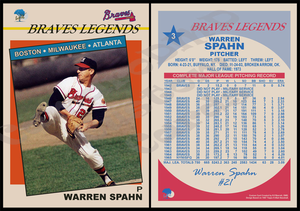
#108 and the K-Mart cards are somewhat unique as they have it on the front in their original full color. The logo itself is a "ripoff" of my dental office's logo. The blue tree with the moon behind it is the logo for my office. I simply applied my signature over it in yellow.
I have gone to great lengths to try and make the logoing as minimally intrusive as I can. With the 1993 Fleer card, it is done in blue, white and red just like the original Fleer logo that was on this card.
As for the design itself, I have always really liked this card. When I was a kid, I really wanted the Joe Montana from the 1993 Fleer set because I thought it was really neat that it noted the trade on the front. Unfortunately, my LCS never seemed to get one and this was back in the days before the internet was what it is today. You could sometimes find photos of the cards, but you could not always find them. I wouldn't actually get one until years later.
As the year started coming to a close and it became more and more apparent that Smith would be traded, I thought this would be the perfect design. I almost started it before the move happened but never got around to it. It was actually done this last weekend (front on Saturday and back on Sunday).
One oddity I find with this card is the team names. I honestly thought you might point it out to me because you look at them with such detail...I was sorta waiting to see if you'd notice it. On the front in the silver oval it says "Traded to Redskins" and on the back it has the Redskins logo. But, on the front...bottom right it says "Chiefs QB." I'm not sure why, but that's how they did them originally...so I kept it. Part of me wonders if the they already had the design ready for print and they just added the oval at the last second. But, if that's the case why did they change the logo on the back?
To me, it seems odd. But, that's how the originals were so that's how I did it.


