Super Bowl Custom Set

CamaroDMD

Insert Cool Title
I have been thinking of doing another custom set since I finished the 40,000 Yard Club set. But, before I started I wanted to get some opinions.

First, let me say that the set will be reflective of the Super Bowls...one card for each game. I want to base it on something that Topps did in their vintage sets. Many sets from the 1970s into the 1990s had a card (sometimes the first card in the set) that summarized the Super Bowl from the previous season. My thought is to take one of those designs, customize it and make a set for all the Super Bowls using it. Done in order, future Super Bowls could easily be created.

So, I went through the Topps history and looked at the various Super Bowl issues and tried to pick out one that I liked the best. I kept going back to 1989. I have always tied 1989 Topps football heavily to my childhood (my brother and I busted tons of boxes of those things thanks to a family friend who owned a card shop that folded right about that time...we had 1989 Topps for several birthdays and Christmas's). So, even though it is not a popular set, it means a lot to me.

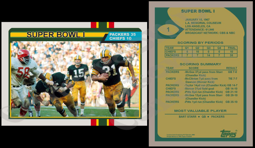
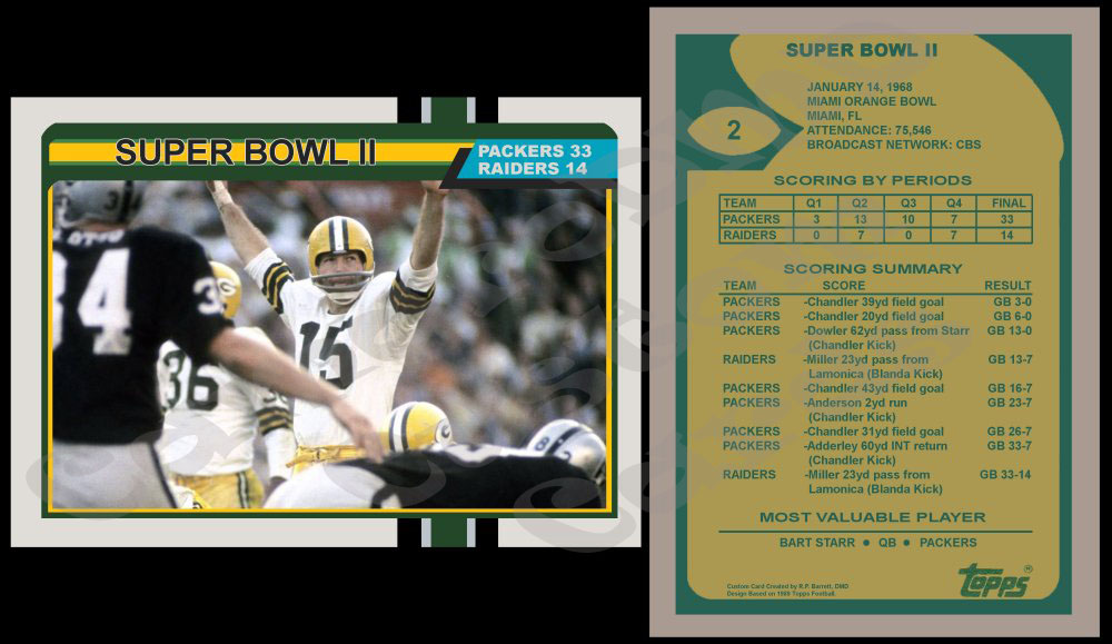
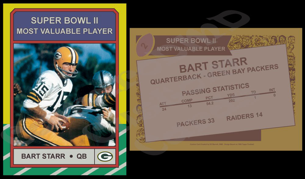
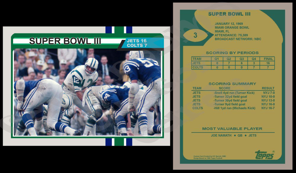
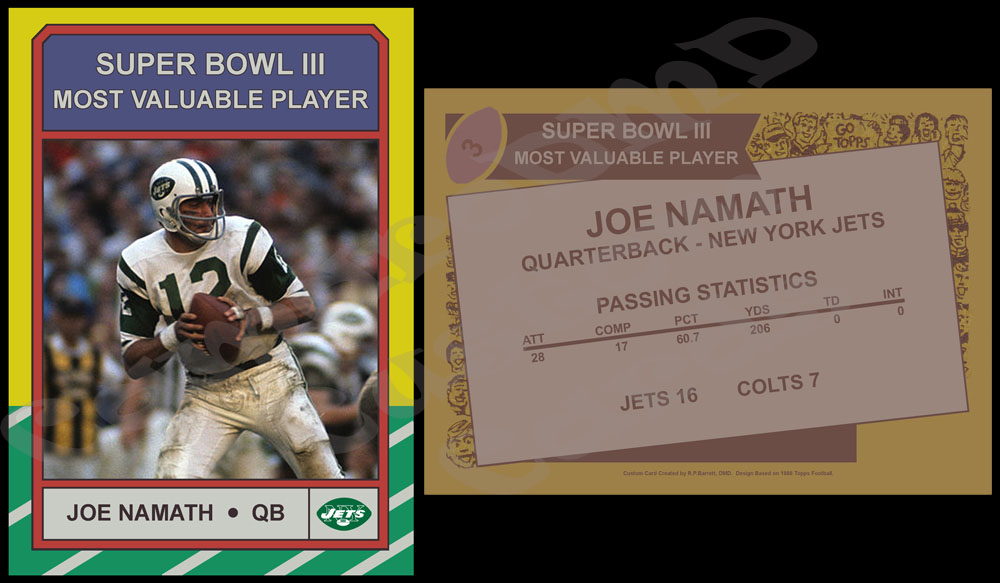
So, my thought was to take the 1989 Topps Super Bowl XXIII card and create a custom for every Super Bowl from I-LI and then forward. I think I will customize the boarder of the card to reflect the winning teams colors but will use original 1989 Topps colors randomly for the stripes on the side. I also think I will adapt the design of the 1989 Topps Team Leader cards for the back rather than use the original Super Bowl card back. Because it is vertical rather than horizontal...I think it will be far easier to list all the scoring for the higher scoring games.

I'd be really interested to hear some feedback about this idea before I jump in.

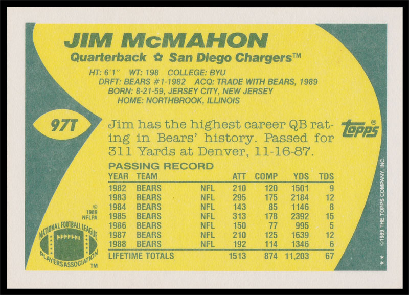
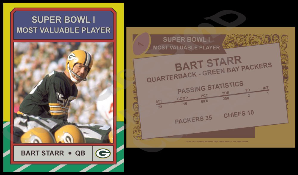
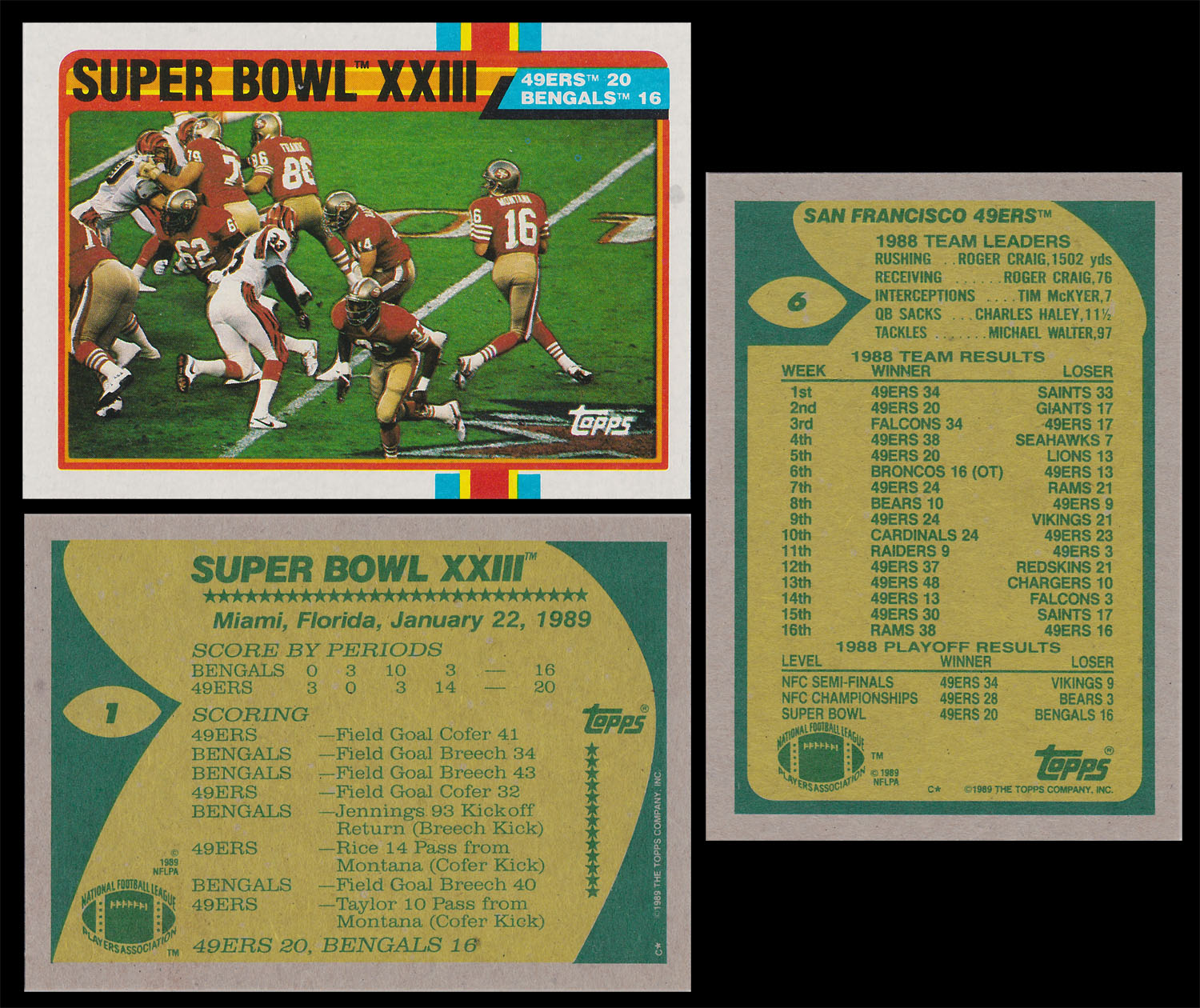
Here are examples of real cards from the 1989 Topps set. On the left is the front and back of the Super Bowl card and on the right is the back of one of the Team Leader cards.

dB37q94.jpg
 
Sounds like a great idea doing a Super Bowl set. Personally, I think switching to the vertical back makes a lot of sense. Not only for your idea of more room for stats, but it also gives it a new feel, and not just a copy of the original.
 
Personally, I think switching to the vertical back makes a lot of sense. Not only for your idea of more room for stats, but it also gives it a new feel, and not just a copy of the original.
I hadn't considered that it would give it a new feel. I like that, especially since the set would have a Super Bowl XXIII card and I would want it to be fairly different.

Another idea I had was (if there is room)...to put the name and game stats of the Super Bowl MVP below the scoring summary. Having the vertical back I think will allow enough room.

I have also been considering doing the back in the colors of the 1989 Topps Traded cards. The fronts are basically the same, but due to the Traded cards being on white card stock...they have a different look to the back. A lot cleaner and brighter. The Traded set didn't have any Super Bowl or Team Leader cards...so it would be more unique in that sense too.

Here is an example of a Traded back. I haven't decided yet it I will do it in the traded colors or in the original set colors.

7u0WEpe.jpg
 
a superbowl set.. with 51 cards... could be pretty cool.. or you could really go crazy and print up a superbowl card with a MVP insert for all 51 games... that would take a while.. but how cool would that be? I'd want a set!
 
a superbowl set.. with 51 cards... could be pretty cool.. or you could really go crazy and print up a superbowl card with a MVP insert for all 51 games... that would take a while.. but how cool would that be? I'd want a set!
Actually I was floating the idea of doing a set of super bowl starting QBs. That would be 102 cards as of next week. I might do an MVP set at some point.
 
just don't waste your time with Pro Bowl cards... wife and I watched about 5 or 6 minutes of the game tonight... no tackling (what's this in the grasp? QBs yes.. other players NO!!!!)... blocking sucked... off sides by the Seattle Seahawks players was just plain stupid... it was something like 3 in a row? (we did start watching the game until the 3rd quarter).
 
Haha. Maybe I'm weird but I actually enjoy the Pro Bowl. I know it's not real football...but I think it's fun. I will admit that this year was much better than years prior though (some years even I couldn't watch). Yes, it's sorta like the NBA All-Star Game...where defense isn't a priority.

As for the card question...no I currently don't have any Pro Bowl cards planned, although I did have a few that I was thinking about. When Mariota looked like he was going to make it (before his injury) I was brain storming one for him. But, that didn't materialize...maybe someday.

Also, I attended the 2013 Pro Bowl so I have several card worthy photos that I took at that game which might one day turn into Pro Bowl cards. I will admit, the Pro Bowl is a lot more fun in person.
 
Last edited:
OK, so I have taken into account a few of the things you guys have said with the Super Bowl cards and I am working on them. I hoping to have the first batch posted online tomorrow. I just need to do some fine tuning and they will be done.
 
So, I know I said it would be tomorrow before these were done...but I had a few minutes tonight and got them finished. After getting some feedback from you guys...I decided to do two Super Bowl sets at the same time.

The first is a card for each game. It is done in the 1989 Topps Super Bowl design. Originally, I wanted to do all the striping on the cards using the original colors from the 1989 Topps set, but the more I played with it the less I liked that. Ultimately, I decided to do the main middle stripe on the side and all the bordering colors in the colors of the winning team. The outer two stripes on the side will be in the colors of the losing team.

Here are the first two:

1989 Topps Super Bowl I
lCgXz75.jpg


1989 Topps Super Bowl II

BA2LweR.jpg


Next, I decided to do a Super Bowl MVP set. This set design is based off the 1986 Topps Record Breaker and Super Bowl card design. With this set, the colors will all remain the same as they did not change at all in the original 1986 Set

1986 Topps Super Bowl I MVP Bart Starr
K0NDJ4r.jpg


1986 Topps Super Bowl II MVP Bart Starr

wfPbYET.jpg


I will continue to do these in pairs...one game card and one MVP card until it is up to date.

I'd love to hear what you think of them.

The cards in this thread are of my own personal design and creation and are not to be used or re-posted without my consent.
 
I like the way they look, and using the team colors on the side stripes is a great idea. I prefer the colors for the Packers on the first card, as opposed to the second card. I understand why you did it that way, matching the colors of the uniforms in the pictures, But to me, Green and Gold, were always synonymous with the Packers. It just doesn't have the same effect on the second card. I believe it would look better using the colors usually associated with each team. Example: The Steelers should be Black and Gold, not White and Gold. The Raiders should be Silver and Black, not White and Silver, and so on. Just my humble opinion.
 
the 1986 design is sweet! going to be a nice looking set! (hey, you do realize OTHER TEAMS won the Super Bowl too.. right? NOT just Green Bay!)
 
I like the way they look, and using the team colors on the side stripes is a great idea. I prefer the colors for the Packers on the first card, as opposed to the second card. I understand why you did it that way, matching the colors of the uniforms in the pictures, But to me, Green and Gold, were always synonymous with the Packers. It just doesn't have the same effect on the second card. I believe it would look better using the colors usually associated with each team. Example: The Steelers should be Black and Gold, not White and Gold. The Raiders should be Silver and Black, not White and Silver, and so on. Just my humble opinion.
I think I understand what you are saying…and I agree that the colors on the SB1 card are more attractive than the SB2 card. But, I think I may have explained the color choises poorly in my original post. Obviously everybody has certain preferences…and that’s good (and I really do appreciate the feedback and interest)…but I want to try and explain my throught process for the colors chosen.

So, I think the easiest way to explain it would be to deconstruct the design of the card. I thought that might be fun anyway as it will give you guys a chance to see the “behind the scenes” design process a little bit.

First off, let me explain the actual card design a little. Like I have mentioned before, it is based on 1989 Topps football. That set had a white boarder stock with a three color stripe running through the cards. For the horizontially oriented cards, that puts the stripe about 2/3s to the right of the card. That stripe ties into the framing design around the photo and the text.

I wanted the dominating colors on the card to be the colors of the winning team. I figured I could use their primary color as the main color and their secondary color for some of the key ascents. In this case, both cards are of games where Green Bay won. I selected green as their primary color and yellow as their secondary and designed accordingly. So, I made the middle band of the stripe green and the bulk of the framing of the photo green. I used their yellow as the ascent around a lof of that where the design indicated.

Below is a breakdown of the card using the Packers color elements. You can see the green center stripe first, the green framing with yellow highlights (I also had to use a slightly lighter green as the design called for it). The third photo are those elements combined:

K7giiWp.jpg


That creates the bulk of the actual card design which makes sense as I feel the winning team should dominate the visual feel of the card. However, I think the other team does deserve some exposure as well. So, I reserved the outer band of the striping for the losing teams primary color and the second band for the secondary color. In the case of SB1 that’s the Chiefs Red/Yellow and in the case of SB2 it’s the Raiders Black/Silver. You can see those design elements isolated below:

VfgFitK.jpg


The combined elements give the card a unique color palate that was specific to that game. It’s the same colors that were on the field the day it was played. See below the combined elements:

RewxAR2.jpg


Obviously, there will be a few repeaters but most of the color combinations will be unique. I think the most obvious example of repeaters will be the Steelers-Cowboys cards once I get to them. Since the Steelers won the first two meetings (SB10, SB13) the card will be primary Black/Gold with a little Blue/Silver. But, the reverse will be true for the SB30 card as the Cowboys won.

My goal is to not use white whenever possible. There are some teams where their true secondary color is white (the next card with the Jets and Colts comes to mind) and I won’t have a choice…but overall my goal is to avoid it.

Also, I’m going to use colors the team wore at the time the game was played. Meaning the SB12 Broncos colors will look different than the SB50 Broncos. The same is true for the SB20 Patriots verses SB51.
 
the 1986 design is sweet! going to be a nice looking set! (hey, you do realize OTHER TEAMS won the Super Bowl too.. right? NOT just Green Bay!)
Oh...I totally forgot about all the other teams. :D

Well, then...here ya go.

Actually, I have had a slow day at the office (a couple patients cancelled last minute) so I have been in front of the computer. So...I got the Super Bowl III cards done. Here they are:

zCtxBpr.jpg


qTdf5b6.jpg


I think one of my favorite parts of this group is the scoring summary on the back of the game card. You don't see many 9 yard field goals these days. :D
 
Last edited:
It makes more sense, now that you explained the process, of how you make them, and what your thinking was. Bottom line though, is that they still look great.
 
It makes more sense, now that you explained the process, of how you make them, and what your thinking was. Bottom line though, is that they still look great.
Thanks for the feedback...I'm really enjoying making this set. I honestly can't wait until I get them done, printed and in my book so I can see them all together...I think it's gonna look really neat.

I'm actually really proud of how I designed the Super Bowl set. Like I mentioned to you privately...I learn something new with every project. With this one...I knew I wanted to duplicate the design in different colors for each card. So, I wanted to set it up so I could easily do that (and not have to remake it from scratch every time). So...the way I built it had that in mind. Within the original .PSD photoshop file there are a bunch of "saved selections" and other preset tools that I created along the way to facilitate that. It doesn't show in the final product itself (other than everything being really uniform)...but from a "learning Photoshop" standpoint it was a very useful experience.
 
Back
Top