My Custom Sports Card Creations

One thing you could do, and you may have already thought of this, is to create some sort of "logo" to add to the front and back of all the cards. Something like the Topps, Panini, and Upper Deck logos. That way you don't have to use a full watermark but your cards are still unquestionably your design. Of course the logo would have to be implemented into the design somehow so it couldn't be removed.

Dang thieves...
I thought about that. I have a logo for my company I could use...I would just add my signature to it. But, I felt like that would be a little too much...plus I would want to put it somewhere subtle and not somewhere where it would cross over the design. Trouble is, those are easy areas to remove. A watermark works better because it affects a lot of the design so it's very hard to remove without recreating the entire design.

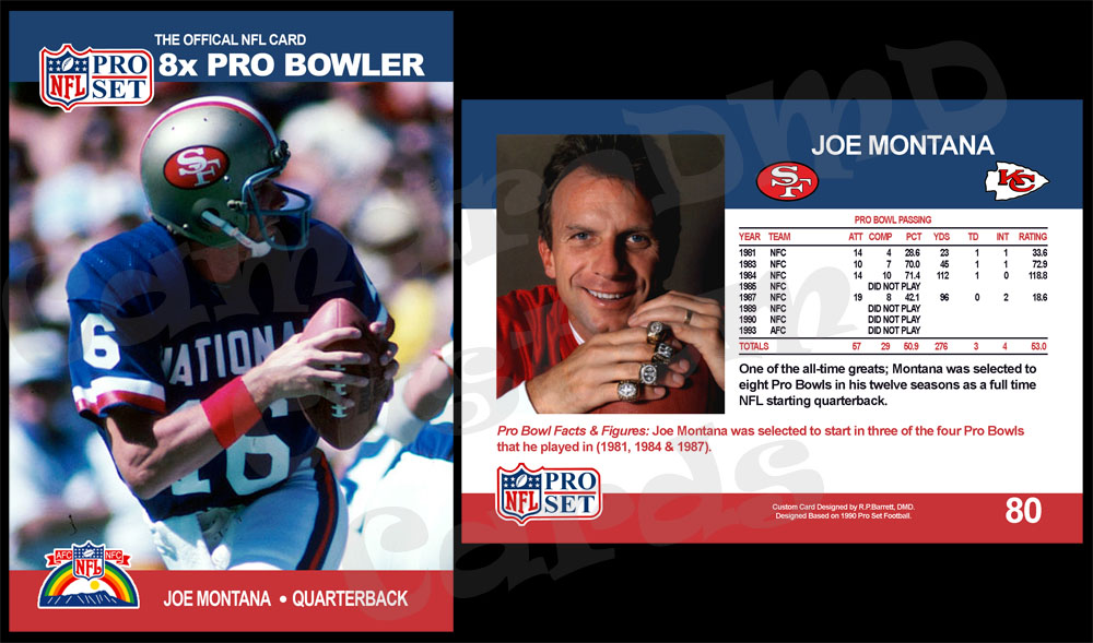
So...here is the next one. A little weekend project. As a kid, I remember the 1990 Pro Set football set a lot. They were so over-produced they were everywhere. So, I had a ton of them. I always really liked the Pro Bowl subset so I thought it would be fun to do a Pro Bowl subset career card for my favorite player...Joe Montana. Here it is:

#80 1990 Pro Set Joe Montana PB
Ex8XHvg.jpg
 
Another great looking card. Also, another nice looking clean basic card set. Even though they were way over produced. It is a very intriguing set to collect, with many errors, and variations.
 
Another great looking card. Also, another nice looking clean basic card set. Even though they were way over produced. It is a very intriguing set to collect, with many errors, and variations.
Totally agree...it was a fun set with a nice clean look. I love the rare varieties...they got so into overproducing their quality control took a hit and as a result they actually made some collectible cards. LOL.

OK. So I told myself I wasn't going to post this one today. I actually started working on it last night and finished it today. I'm not going to lie, this might be my favorite custom yet. I just love how it turned out. I was going to wait a few days to post it because I might not have time to make anymore this week. But, because of how it looks I can't wait to show you guys.

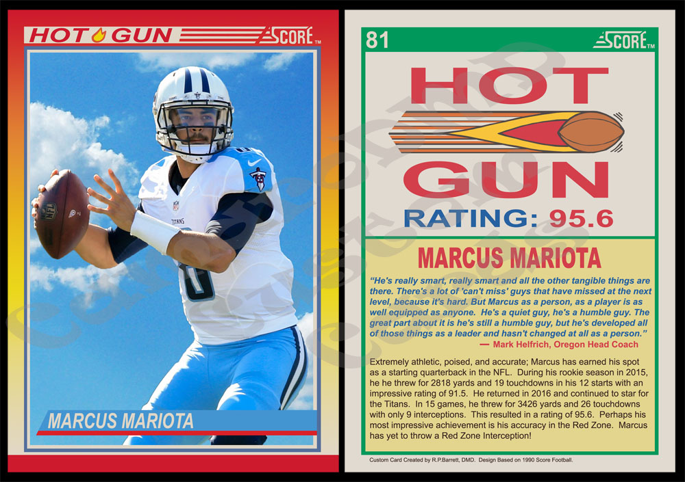
Like the previous custom...I did this one based on a a subset from an overproduced set from my youth. I remember busting several boxes of 1990 Score football because it was dirt cheap. One of my favorite finds in those boxes were the "Hot Gun" subset cards. I liked the design and they focused on big name star QBs...and who doesn't like that.

So, I decided I would try and create my own. It's a somewhat complicated design that took some effort. But, I'm really happy with the results and I learned a few new Photoshop tricks!

So, here it is:

#81 1990 Score Marcus Mariota HG
L7vGBWs.jpg
 
Looks good, very cool picture. Is that the actual photo, or did you insert the background?
I'm glad you like it...I'm really happy with this one.

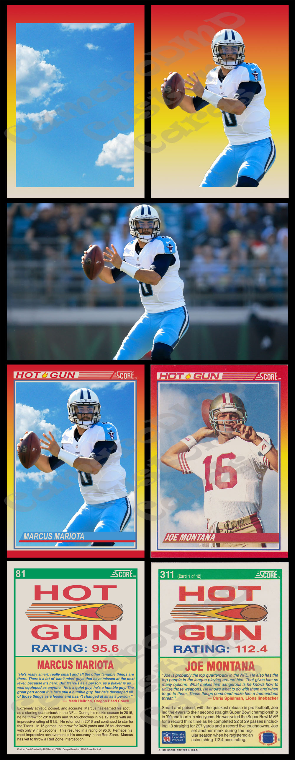
To answer your question...I inserted the background. It's basically two photos on top of each other. The bottom photo is a photo of a cloudy sky I found. On top if a photo of Mariota that I took and carefully cut him out of with Photoshop. Below I have taken the card apart so you can see it in pieces. Basically, I made everything invisible except for the background colors and the respective photo. On the left the sky, on the right Mariota. Below that is the original photo of Mariota that I used.

Just for fun, I also put the custom card below that on the left next to an original 1990 Score Hot Gun. The Joe Montana is a scanned card from my collection which I used as a model. Some of the fonts don't match perfectly...but overall I think it turned out really nice.

qPXz1mD.jpg
 
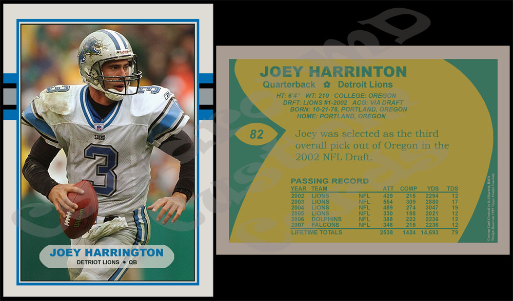
OK, here's a quick one that I did. I know he didn't really have the NFL career that I had hoped he would...but I was still a pretty big fan of his.

#82 1989 Topps Joey Harrington
VuvqMJT.jpg
 
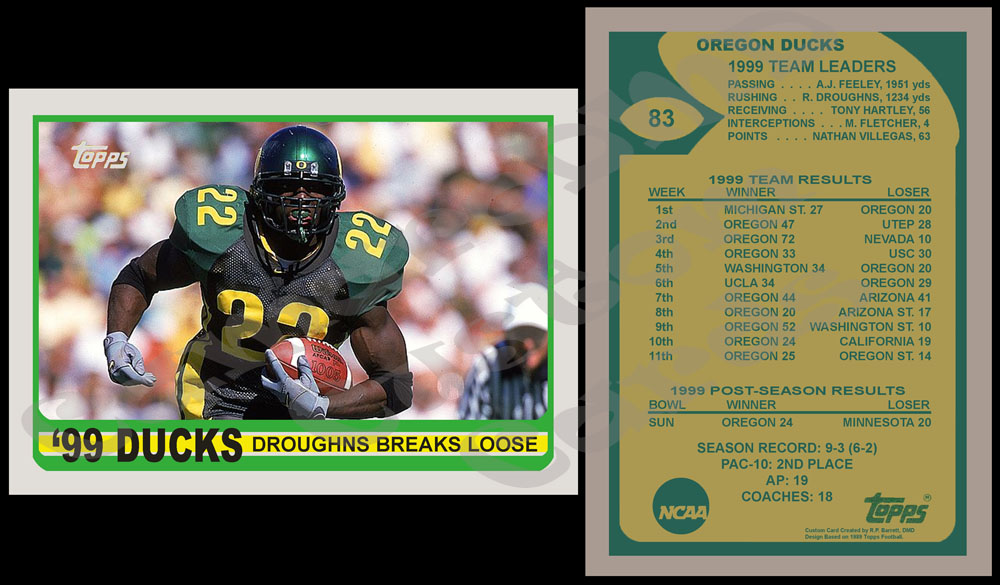
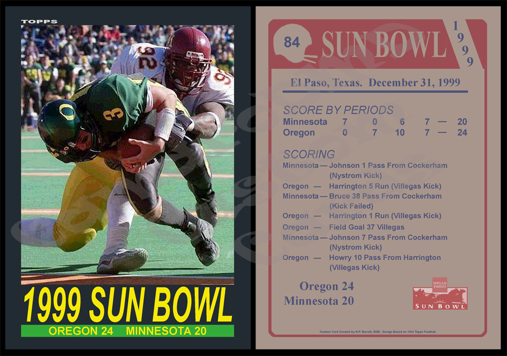
Did a couple more quick ones today. These continue my cards dedicated to the Oregon football teams that I grew up watching (and their bowl appearances).

#83 1989 Topps '99 Oregon Ducks
CGQY13w.jpg


#84 1985 Topps 1999 Sun Bowl
Bl7VGWH.jpg


An interesting side note here for our local Michigan State fan (I believe that's you Randy). If you look back at my 1998 Oregon card (#61) you will see Oregon's opener that year was at home against MSU. I was at that game which was played in Eugene and I watched my Ducks throttle your Spartans. Being a home-away series, Oregon traveled to East Lansing in 1999 and lost a close game to the Spartans.

The reason I mention this is because there is a lasting memory I have from those games (the game in Eugene that I attended and the game in East Lansing I watched on TV). I'm curious if you remember this as well. In the 1998 game, a Michigan State player suffered a serious neck injury that at the time looked like it might be career ending and even have long term affects on his mobility. I don't remember his name, but I remember seeing him injured. He would recover and return for MSU...his first game back that 1999 game against Oregon. I remember it being a significant "feel good" story at the time.
 
OK, here is my next one. This card is designed in the style of a set I remember closely linked to my childhood. When I was a kid, Post Cereal brought back back baseball cards and inserted them into boxes of their cereal. I think they did this for about 5 years in the early to mid-90s. I mostly remember the 1993 and 1994 sets...I remember my brother and I would fight over the card in the box.

For some reason, I always liked the 1993 set the most. I think I just really liked the design.

Most cards in the set had very plain designs with no "additional features." However a couple cards had extra logos and I remember those standing out in my head. There were a couple cards labeled as "Rookie Stars" (I believe one of them was Eric Karros) and there were a pair of cards that made mention of two players joining the 3000 hit club in 1992 (Robin Young and George Brett). I remember especially liking the 3000 hit cards...so some time ago I decided that a card with that design would be a fun challenge.

Last year with Ichiro got his 3000th hit, I thought he would be the prefect subject of such a card. So, I put it on my list...and then quickly avoided it. As someone who is still a novice with Photoshop, I thought the design of the 3000 hit logo was beyond what I could handle. In addition to that, the Post cards lacked licensing so all the team logos are airbrushed off. To do it right, I would have to do the same thing. Again...it felt too difficult. So, I avoided the card.

It occurred to be recently that such behavior was dumb. That I had proven to myself over and over that I could create challenging designs if I simply put forth the effort. The truth is, learning Photoshop and creating things with it has been a total confidence booster for me in my life. Photoshop was always "too hard" to even attempt to figure out. Once I finally tried and realized I could do it...I'm realizing that I can do many things. So, why would a 1993 Post 3000 hit card be any different.

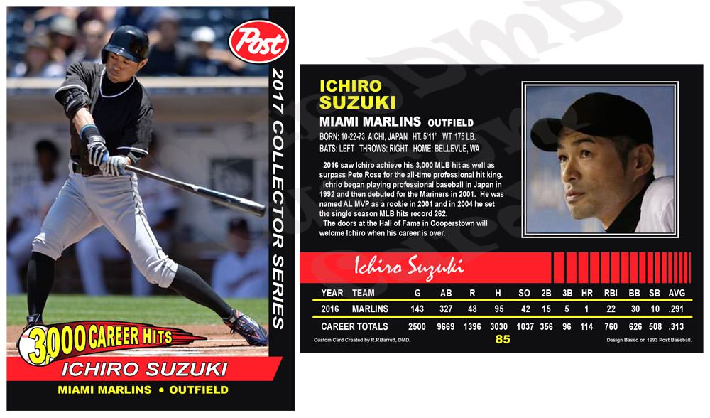
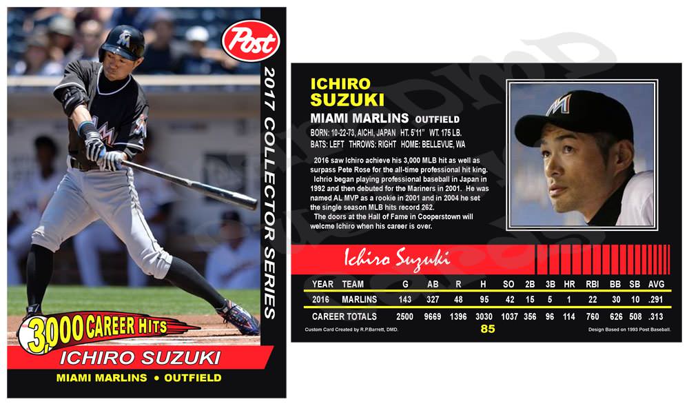
So, I finally got around to creating it. Here it is:

#85 1993 Post Ichiro Suzuki
HOoCi4K.jpg
 
I like the way these came out. Just a thought though, being as this is your project, for your personal collection. Why not leave the team logo's intact? It will still give you the feel of the original set, but add a little more of your own personal touch.
 
Why not leave the team logo's intact? It will still give you the feel of the original set, but add a little more of your own personal touch.
I thought about it...but I decided that I wanted to remove it. As a kid...I remember this being my first introduction into the issue of trademarking and licensing. I remember being confused why there were no logos and those cards stand out in my memory because of that. I thought I should replicate that.

But, one of the great beauties of Photoshop is the logos aren't really gone. Because everything is done as layers...I'm not actually airbrushing the photo itself. I lay a transparent layer over the photo and airbrush the logo areas out on its own layer. So the "logo blocks" can simply be hidden and the logos re-appear.

48KXMUt.jpg
 
Nice! May I request a Rickey Henderson Post Cereal 3000 hit club card? I know the logos won't be there, but he was with the Padres when he got his 3000th. If it is possible to find pics from when he was with them.

And while I am thinking of Henderson in card designs that I thought were cool. I could not believe that Henderson was not in the 2003 Yankee Stadium Legacy set. Is that one a possibility?
 
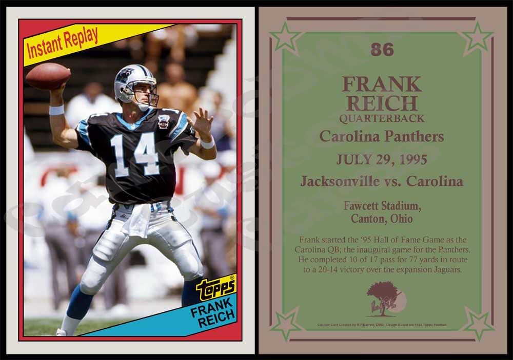
Here is the next one. This one is based on the 1984 Topps Instant Replay Subset. Basically, cards at this time typically didn't not have live action photography on them...but Topps had been placing "live" style cards in sets here and there as a subset. In 1984, they looked like this.

My custom commemorates the inaugural game of my favorite team the Carolina Panthers featuring the QB who started that game.

#86 1984 Topps Frank Reich IR
rYgwaRI.jpg


Also, with this set I decided to do something a little different. I have always avoided putting a logo of my own on the cards as I didn't want to distract from the original design. In light of some recent issues...I think I might be changing that. I want to make it more clear on the cards that they are customs...but I still want to do it tastefully. You will likely see a reduction in "brand logos" on my cards going forward and instead see more of my logo in their place (not always, but somewhere on most cards).

I have started that with this set. I have taken the logo for my dental business and simply overlayed my signature on it. For this card, I replicated the Topps logo on the front but on the back I put my logo in the NFLPA logos place. I altered its colors to match the card to better blend in. Hopefully that doesn't take too much away from the card. I'd like to get some feedback on that if you guys are willing.
 
Nice! May I request a Rickey Henderson Post Cereal 3000 hit club card? I know the logos won't be there, but he was with the Padres when he got his 3000th. If it is possible to find pics from when he was with them.

And while I am thinking of Henderson in card designs that I thought were cool. I could not believe that Henderson was not in the 2003 Yankee Stadium Legacy set. Is that one a possibility?
The Post card is not a problem. I will start working on it now. I can do it with logos or without...it doesn't matter to me. Keeping the logos in place is easier but it's also less authentic to the original 1993 Post card design. I can do it either way.

I am not familiar with the 2003 Yankee Stadium Legacy Set. If you could get me some info about it I will look into it and see what I can do.

Right now, I am not actually producing any cards. I'm more in a design mode (producing them is a pain). I still have all my production supplies but its just not something I am working on at the moment. I'd be happy to make them at some point, but I don't know when it would be. Probably sometime in the fall when I'm less busy.

But, I'm happy to work on designs for now.
 
Your logo looks fine to me! Go for authentic with the Henderson card so NO logos please.

2003 Upper deck Yankee stadium Legacy - Basically one card for every game ever played at old Yankee stadium. On the front there was either a b/w or color photo of a player that played in the game on the date depicted. The set was broken down by decades. There were of course multiple cards of a lot of different subjects as babe ruth, jeter, reivera all played a lot of games there. If I remember, the card back had a box score and a lot of times a highlight or synopsis of that particular game. There are over 6,600 card in the set. again, one for every game played at Yankee stadium.

Link to the cards on ebay.
https://www.ebay.com/sch/i.html?_odkw=2003 yankee stadium legacy&_osacat=0&_from=R40&_trksid=p2045573.m570.l1313.TR0.TRC0.H0.X2003 upper deck yankee stadium legacy.TRS0&_nkw=2003 upper deck yankee stadium legacy&_sacat=0

http://upperdeckblog.com/2009/07/brag-photo-of-the-week-the-yankee-stadium-legacy-collection/
 
Last edited:
Back
Top