An introduction

Dave Auwerda

Bench Warmer
Hello All,

My name is Dave Auwerda, I am a history teacher and football coach living in Illinois. I'm a long time TTMer and have been a custom card designer since 2010. I stumbled on the forum here when some of CamaroDMD's work splashed across a Google search.

I have been a TTM guy since the mid-1990's, but really started getting back into it hardcore in 2010 when I started creating my own designs in Photoshop. I've dabbled with set re-creation in the past, such as much of CDMD's work, but I tend to create my own designs from scratch more often than not.

Here is a link to some of my work I've created and sent out. Since 2010, I've received just under 500 TTM requests back, at about a 69% return rate. I focus on my favorite Chicago teams (Cubs, Bears, Blackhawks) but dabble in other areas, too. One of my favorite sets as of late is my XFL set, for which I currently have a number of requests out.

I'm looking forward to learning more about the forum here, and the people in it. And, I'm always interested to get feedback from people about my designs.

Cheers,

DA
 
Welcome to SCC! It's a beautiful weekend just to relax and check out the site!

If you have questions, post them up or send a private message to someone.. we are all willing to help!
 
Welcome to SCC. We have a fun little site here and we are always excited to see new members. We love to see the place grow!

I think I have seen your customs on SCF before. I remember a year ago or so when I was first starting to tinker with Photoshop...I looked over a few people's work online that I found and you were one of them. You have some really impressive work. I have yet to get too totally custom yet...mostly sticking to recreating or modifying old designs but maybe one day I will get up the courage and do something of my own. I'm a big collector of vintage football cards so for now I think my design interest relates to that.

I'd love to chat with you about your production process. I have a system that works pretty well for me but I am always looking for new ideas and ways to improve it.
 
I'm fairly good at using Photoshop, but I'd be curious to know how you guys are making cards with it? I've never really done anything for print with Photoshop. Everything I do is web oriented. What canvas size do you start with? How do you get it to print at the right size? I've played with it a few times, but never could get my printer to print what I was making at the same size as a real card.

Oh, and welcome to the site @Dave Auwerda!
I'm sure everyone has their own way of doing this...but this how I do it. I'm sure there are a ton of ways that work just as well (if not better), but this system has worked for me.

First question is really easy to answer. The canvas size I use is 1500x2100 (or 2100x1500 for horizontal cards). That is the proper ratio for a standard sized card (I have never done anything other than standard size). It's high enough resolution so you have plenty of pixels to do just about anything you want design wise. Sometimes it's a little annoying because finding photos online with a high enough resolution can be difficult and frequently I have to stretch them. Normally it still looks OK when printed because the cards are ultimately pretty small. A smaller resolution would probably be fine (provided the same ratio is used) to offset that issue. For me, I designed by printing system with this specific size in mind and have been using it from the start...so I have stuck with it.

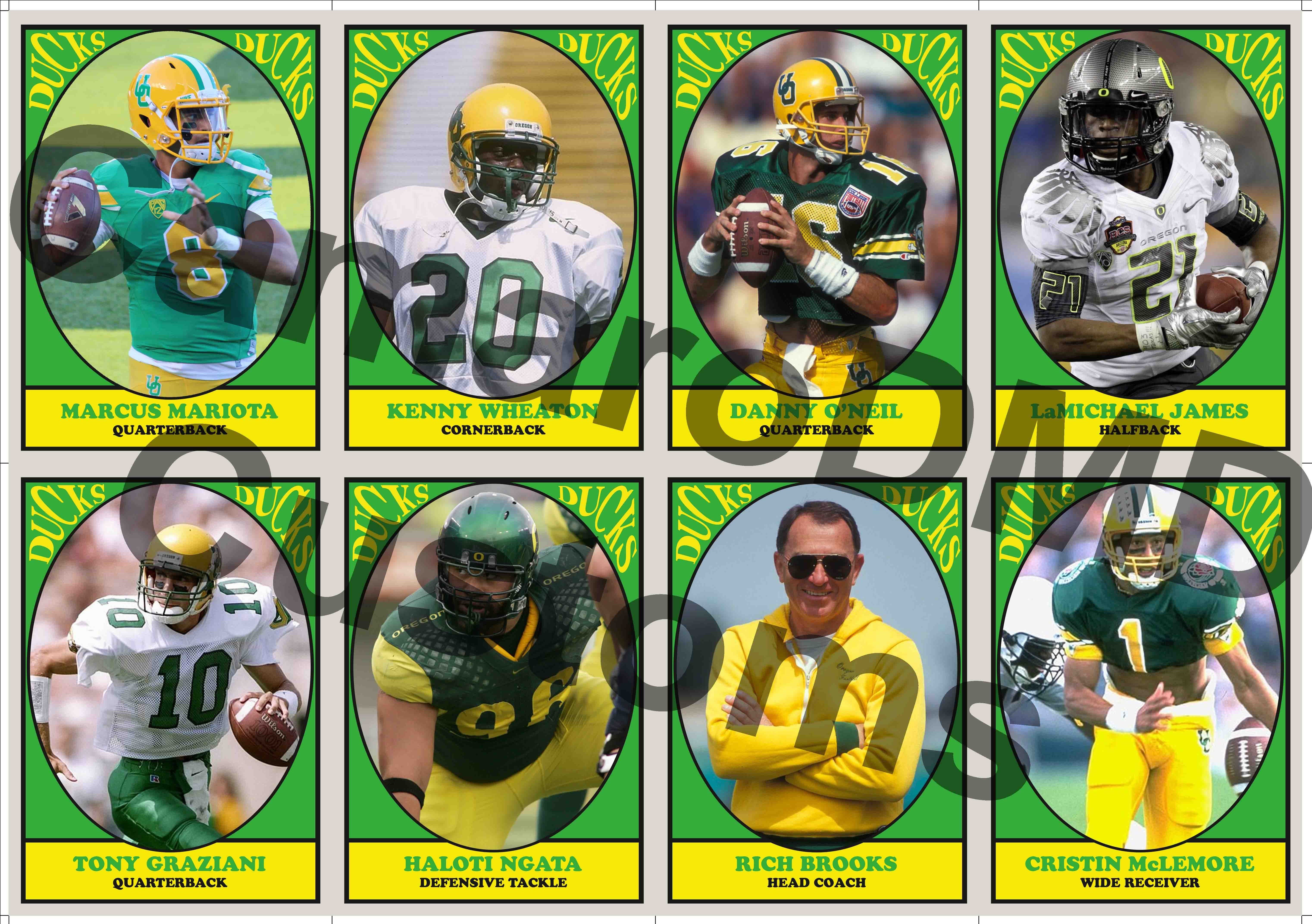
Printing the cards is a bit for challenging. I print the cards in 8 card sheets. I created a template in Photoshop that's 6086x4286 and put the 8 cards on that. I have a series of grids that I line the cards up on so they are always in the right place (the lines extend to the edge of the template to provide for cutting guides). There are also lines that run along the top and left of the template (top and right for back templates). Those extra lines are where I cut the sheet prior to assembling the cards. My printer doesn't print perfectly centered for some reason...so I had to create a point in the print that is a uniform distance from the cards. I cut along that line and then use that as the edge when I glue the cards to the card stock.

The front sheet is on a transparent background while the back sheet is on a background that corresponds to the color of the backs of the cards.

As far as actually printing, I print them right from photoshop. I let photoshop determine the colors. I print them landscape on normal 8.5x11in photo paper. I have found that for my template, the scaling factor is 7.143in in height. That makes the cards just a tiny bit big but allows for final trimming to make them look really nice.

I have posted a photo of a print template below so you can kind of see how I do it. I'd be happy to send you a print template .psd if that would help. PM me if you'd like one.

One of these days, I will write a full legit tutorial (perhaps I will start it today) explaining my whole creation process. In the mean time...if you have any questions, please ask. I really have no trade secrets with my customs...I will share any info that you need with you.

VQAzBI6.jpg
 
Back
Top