CamaroDMD
Insert Cool Title
So, now it is time to create the back side of our digital card. In this section, I will use some of the same techniques described in Part 1…but I’m not going to go into the same kind of detail (just for the sake of saving reading time). Several new tools and techniques will be used as well but with those I will do my best to thoroughly explain them.
Some custom card creators tend to avoid the backs. Either they make a generic text based back for use on all their cards or they just leave them blank. Frankly, the back side of the card is far more tedious and not nearly as much fun to make. If you choose to do a basic back for all your cards that is perfectly acceptable. However, I think a back that matches the front really brings the card together and makes for a far handsomer final product.
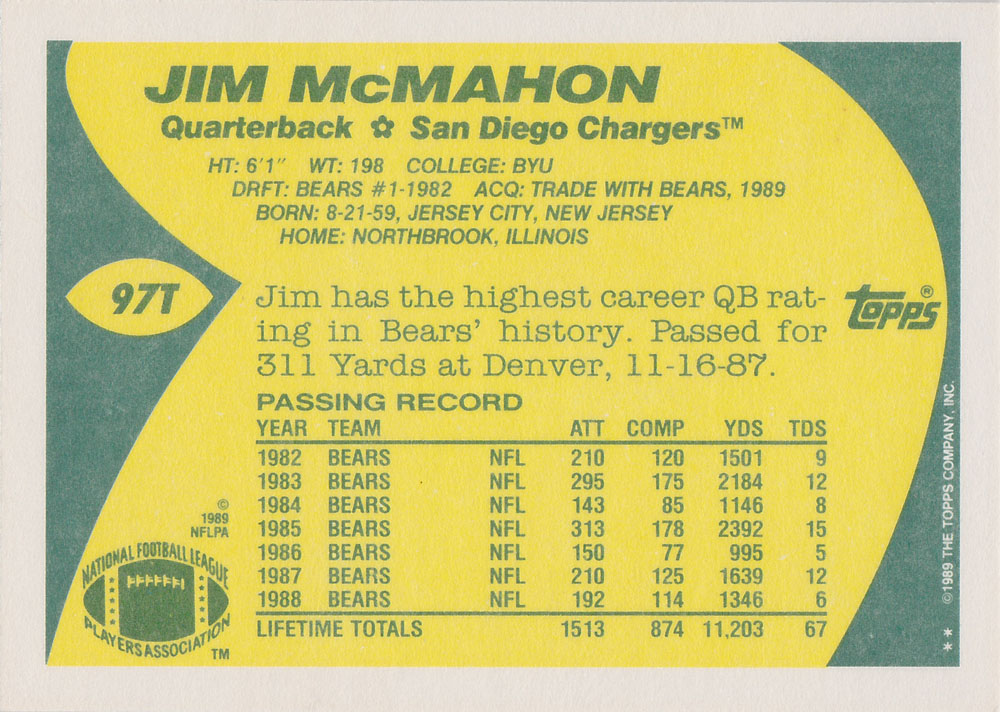
For the back of this card, we are going to continue to use the 1989 Topps design. Because the “theme” of the card is Joe Montana becoming a member of the Chiefs…this will be a replication of the Topps Traded cards. The front of the 1989 Topps traded set is virtually identical to the front of the standard 1989 Topps set. The back however is very different as the Traded set was made on white stock. So, I have had to track down an example of a Traded card to use as a template for the back. To make it even simpler, I have selected the back for a QB. So, we will be using the back side of the 1989 Topps Traded Jim McMahon.
Create a new project in Photoshop just like you did for the front, except this time set the width to 2100 pixels and the height to 1500. This is because the back sides of these cards have a horizontal design. Bring in your template and center it over your project. Just like before, name the background layer and the template layer.
Use the eye dropper tool to take a sample of the color from the white stock boarder and fill the Background layer with this color.
You will notice the inside the white stock boarder, there is a green rectangular shape with a yellow design inside (where the text is). Use the eye dropper to sample the green color. Make a new layer called “Green Boarder.” With the rectangular marquee tool, trace the green rectangle and fill it with the green color. You should now have this:

Next, we are going to create that yellow internal shape. Drag the template layer to the top of the layers list and then create a new layer called “Yellow Inside.” Put that later just below the template.
With that layer highlighted, use the eye dropper and select the yellow color. Next, select the pen tool. With this tool, you can create a custom shaped selection. Click along the outside of the yellow shape and you will see “anchor points” being laid down. The closer together you place them, the smoother curves will be. Click along the whole perimeter of the yellow shape. I choose to go a little long on the top and bottom (into the white boarder)…which I will clean up later. As you are doing this, the area inside your selection is filling. You just don’t see it because it’s happening on the layer under your template. If you hide the template, you will see it.
Continue the trace the whole shape until you have returned to your first anchor point. The area will be completed once you click on the original anchor point. If you place an anchor point that you don’t like, simply right click on it to delete it.
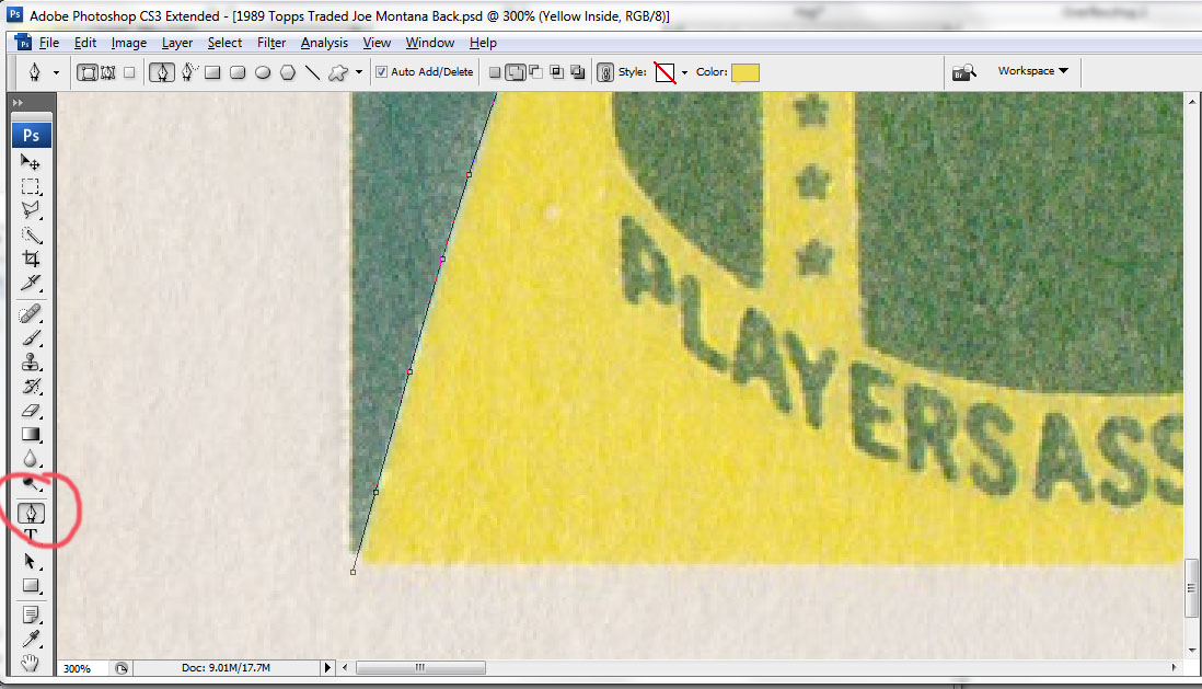
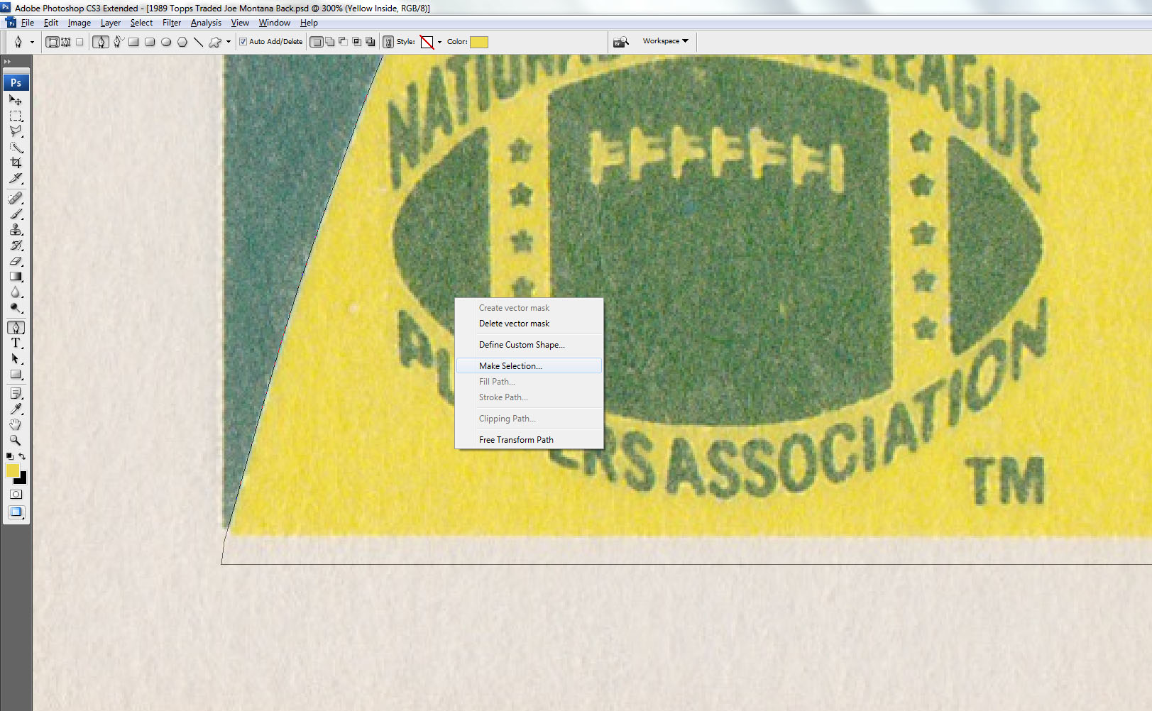
Save this selection by right clicking inside the selection and clicking “Make Selection.” Leave the Feather Radius as “0” and click OK.
This layer can be difficult to manipulate. So, what I do is create a new layer. Using that saved selection, fill it with the yellow color. You can then delete the original layer where you laid out your anchor points (right click on the layer in the layer menu and click “delete layer”).
Your card should now look like this:

You will notice that I made the yellow area slightly above and below the green rectangle. We need to correct that. One of my cardinal rules for custom cards is making sure everything lines up…it makes the card look much cleaner to the eye. I take great effort to make sure everything lines up perfectly…and this is one of the ways I do that.
In this case, we want the yellow to be perfectly flush with the green rectangle. So, take your rectangular marquee tool and create a selection that is right up against the green rectangle that extends to the top of the card. Once you have it lined up perfectly against the green rectangle, make sure you have selected the layer for the yellow inside shape. Press delete. That will delete all the yellow inside the selection and everything should line up.
Repeat this process for the bottom boarder as well. Now, the yellow should be perfectly flush with the green. In the case of my card, I had to do it on the left side at the very corner as well…so be sure to check that.
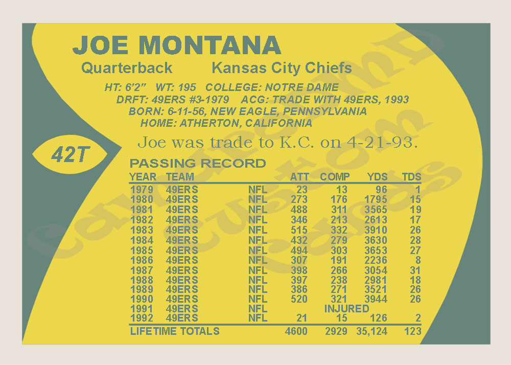
Next, use the same pen tool process to create the football shape where the card number goes. Once you have done that, the all the design elements of the back are in place and it’s time to start working with text. Your card should look like this:

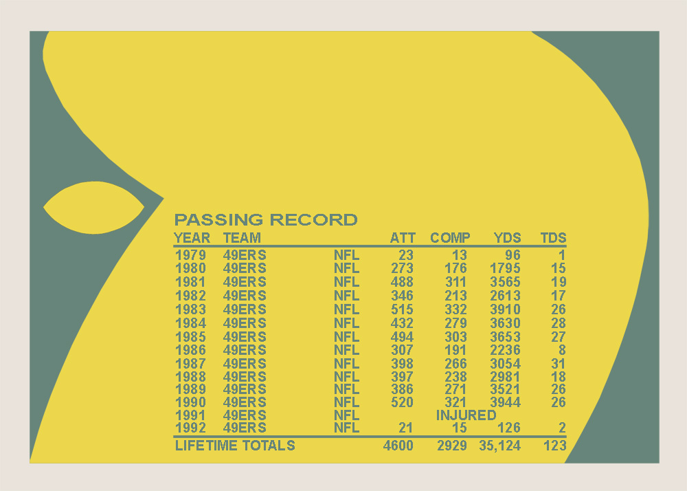
Now that all the design elements are in place, it’s time to start adding the text. I like to start with the stats first. The reason for this is it can take up a lot of the back of the card. For example, our template of Jim McMahon shows stats from 1982-1988. So, seven seasons, a career total, two lines, a title and a heading. Our card is being designed to capture that moment when Joe Montana was traded to Kansas City. For that to make sense, we need stats for all of his season with the 49ers (1979-1992)…so 14 seasons. This will affect how much other text we can have on the back. For that reason, I like to start here.
Use the eye dropper tool to select the green boarder color, this will be the color for our font. Using the Horizontal Type Tool, type over the top of the line that says “Passing Record.” Match the font as close as you can. I used 50 font Arial bold, but once I got it typed in hit “CTRL+T” to enter free transform mode and stretched the font a bit to make it look right. Again, use the Horizontal Type Tool and create the “Year, Team, ATT, ect.” line above the stats. I found that 41 Arial bold worked well here.
Now, we need to create that line above the stats. Create a new layer called “Line 1.” Use the rectangular marquee tool to trace the line and then fill it with the same green color.
It should now look like this:

Now, it’s time to start entering the stats. Type in the first line of stats in the exact same way as you did for the “Year, Team, ATT, ect.” Line. Use the same font type and size. Once the stats are all typed in for the first season (1979), right click on that layer and select duplicate. Name the duplicate layer “1980.”
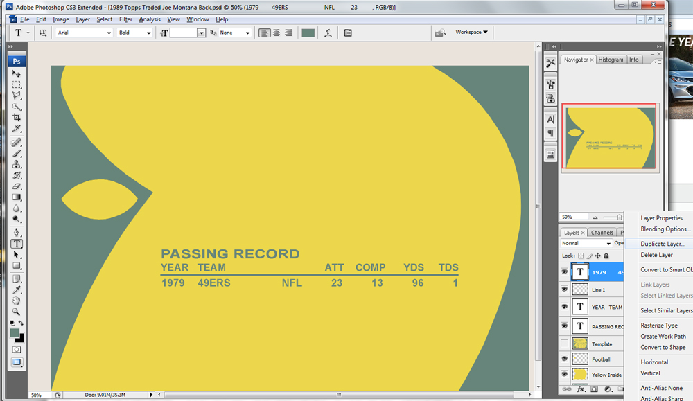
Next, using the arrow tool (with the 1980 layer selected)…move the 1980 layer of text down to the next stat line using the down arrow.
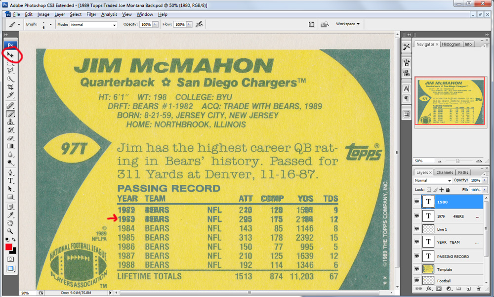
Now edit that text be appropriate for that year. Repeat this process until you have done years 1979-1985. Now, you are out of room. So, press shift and select all the stat layers, the line, the “Year, Team, ect.” Line and the “Passing Record” line. Now, using the arrow tool and the up arrow button on your keyboard…move all those lines upward until the 1985 season is in line with the top stat line on the template.
That gives us enough room for stats through 1991, so we will have to bump it up a little further for the last time later. One thing I noticed once I moved all the stats up was I’m actually out of room due to the stats crashing into the bio information above. So, what I will do is I will condense the stats together a little once I have them all into place. If I tighten their spacing I should be able to save some space. The other option is to reduce the font size but I’d prefer not to.
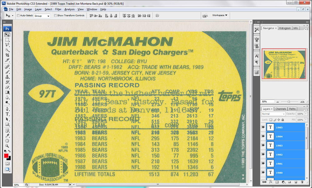
Once you get all the stat lines in place through 1992, use the same duplication ****od to duplicate the Line and bring it down to the bottom. Then, make the “Lifetime Totals” stat line.
At this point, I decided the best thing to do was to squeeze lines together a bit more and then bring the whole stat box closer to the bottom edge of the card. I did this by selecting the appropriate layers and using the arrow tool. It took a little adjusting, but ultimately I was happy with the results.
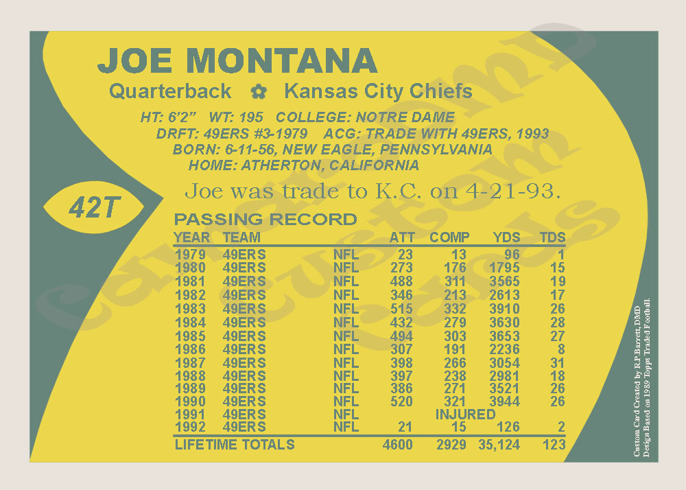
At this point, re-create all the text on the back of the card (Name, Bio, Card Number, ect.) using the horizontal type tool. With the little room remaining, you can add a small amount of text about the player if you’d like. Feel free to experiment with different fonts and sizes to make it look just right. Here is my card after I added all the text. Note I put a “T” after the card number because this is supposed to mimic the “Traded” set.
So, we are almost done. We only have a few details remaining to create.
The next thing we will create is the “flower” like structure between the position and team name. We could do this with the pen tool, but I will do it with the magic wand tool instead. Select the magic wand tool (circled in red) and make sure the “+” option is selected (circled in blue). A brush size of 4 is about good.
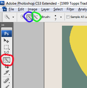
Create a new layer called “flower.” With your template at the top of the layers, visible and selected, click on the flower shape. The magic wand tool will do its best to select the flower. Once the flower is selected, click the “-“ wand tool (circled above in green) and click on the center yellow dot to de-select that area. Once you have the selection to where you want it, select the “flower” layer and hit ALT+DELETE to fill it with the same green color. You made to move your filled flower a little to center it on your card.

There are a couple things you can do at this point. If you choose to, you can replicate the Topps logo and the NFLPA logo. One way you can do this is use the pen tool. Slowly re-create the images one piece at a time. Normally, this gives the best results. Another way (although the results aren’t as good) is to create a duplicate of your template. On the duplicate use the magic wand to select feature. Then, press Shift+CTRL+I to reverse the selection. Then press the delete key. This will delete everything except what you selected.
Normally, I don’t worry about those things. Every once in a while when I want to make a really authentic card I will, but normally I don’t. For this card, I’m going to skip that.
The final piece to the card is the designer’s signature. You should sign your work in some way. I have seen this done in a variety of ways. I have seen people replace the Topps or NFLPA logo with a custom logo which you can do. Personally, I feel that’s a little “over the top” and I prefer to be more subtle. But, you have done the work so feel free to make your mark on it in a way that suits you.
For me, I prefer something simple that doesn’t distract from the card. Normally, the card will originally have some kind of trademark line on the back. Often it’s towards the bottom of the card. I prefer to replace their trademark with my own line. Normally, I will try and size it and color the font in the same way they did for the original card. That way, it blends into the card a bit because there was text there on the original card.
I always do it exactly the same way. There are two lines to my “signature” line. The first line is my name as the creator of the card; it says “Custom Card Created by R.P.Barrett, DMD.” Next, I feel obligated to give credit to the original card because I am simply borrowing their design. So, I write: “Design Based on 1989 Topps Traded Football.” In the case of this card, that’s on the bottom right corner up the side of the card (which is the bottom when the card is actually printed). Use the horizontal type tool and once you have it done, use free transform more to rotate and position it.
That should do it, the back is now done:
If anything here is unclear or you have any questions or comments, please post them or PM me. I hope this was helpful.
Some custom card creators tend to avoid the backs. Either they make a generic text based back for use on all their cards or they just leave them blank. Frankly, the back side of the card is far more tedious and not nearly as much fun to make. If you choose to do a basic back for all your cards that is perfectly acceptable. However, I think a back that matches the front really brings the card together and makes for a far handsomer final product.
For the back of this card, we are going to continue to use the 1989 Topps design. Because the “theme” of the card is Joe Montana becoming a member of the Chiefs…this will be a replication of the Topps Traded cards. The front of the 1989 Topps traded set is virtually identical to the front of the standard 1989 Topps set. The back however is very different as the Traded set was made on white stock. So, I have had to track down an example of a Traded card to use as a template for the back. To make it even simpler, I have selected the back for a QB. So, we will be using the back side of the 1989 Topps Traded Jim McMahon.
Create a new project in Photoshop just like you did for the front, except this time set the width to 2100 pixels and the height to 1500. This is because the back sides of these cards have a horizontal design. Bring in your template and center it over your project. Just like before, name the background layer and the template layer.
Use the eye dropper tool to take a sample of the color from the white stock boarder and fill the Background layer with this color.
You will notice the inside the white stock boarder, there is a green rectangular shape with a yellow design inside (where the text is). Use the eye dropper to sample the green color. Make a new layer called “Green Boarder.” With the rectangular marquee tool, trace the green rectangle and fill it with the green color. You should now have this:
Next, we are going to create that yellow internal shape. Drag the template layer to the top of the layers list and then create a new layer called “Yellow Inside.” Put that later just below the template.
With that layer highlighted, use the eye dropper and select the yellow color. Next, select the pen tool. With this tool, you can create a custom shaped selection. Click along the outside of the yellow shape and you will see “anchor points” being laid down. The closer together you place them, the smoother curves will be. Click along the whole perimeter of the yellow shape. I choose to go a little long on the top and bottom (into the white boarder)…which I will clean up later. As you are doing this, the area inside your selection is filling. You just don’t see it because it’s happening on the layer under your template. If you hide the template, you will see it.
Continue the trace the whole shape until you have returned to your first anchor point. The area will be completed once you click on the original anchor point. If you place an anchor point that you don’t like, simply right click on it to delete it.
Save this selection by right clicking inside the selection and clicking “Make Selection.” Leave the Feather Radius as “0” and click OK.
This layer can be difficult to manipulate. So, what I do is create a new layer. Using that saved selection, fill it with the yellow color. You can then delete the original layer where you laid out your anchor points (right click on the layer in the layer menu and click “delete layer”).
Your card should now look like this:
You will notice that I made the yellow area slightly above and below the green rectangle. We need to correct that. One of my cardinal rules for custom cards is making sure everything lines up…it makes the card look much cleaner to the eye. I take great effort to make sure everything lines up perfectly…and this is one of the ways I do that.
In this case, we want the yellow to be perfectly flush with the green rectangle. So, take your rectangular marquee tool and create a selection that is right up against the green rectangle that extends to the top of the card. Once you have it lined up perfectly against the green rectangle, make sure you have selected the layer for the yellow inside shape. Press delete. That will delete all the yellow inside the selection and everything should line up.
Repeat this process for the bottom boarder as well. Now, the yellow should be perfectly flush with the green. In the case of my card, I had to do it on the left side at the very corner as well…so be sure to check that.
Next, use the same pen tool process to create the football shape where the card number goes. Once you have done that, the all the design elements of the back are in place and it’s time to start working with text. Your card should look like this:
Now that all the design elements are in place, it’s time to start adding the text. I like to start with the stats first. The reason for this is it can take up a lot of the back of the card. For example, our template of Jim McMahon shows stats from 1982-1988. So, seven seasons, a career total, two lines, a title and a heading. Our card is being designed to capture that moment when Joe Montana was traded to Kansas City. For that to make sense, we need stats for all of his season with the 49ers (1979-1992)…so 14 seasons. This will affect how much other text we can have on the back. For that reason, I like to start here.
Use the eye dropper tool to select the green boarder color, this will be the color for our font. Using the Horizontal Type Tool, type over the top of the line that says “Passing Record.” Match the font as close as you can. I used 50 font Arial bold, but once I got it typed in hit “CTRL+T” to enter free transform mode and stretched the font a bit to make it look right. Again, use the Horizontal Type Tool and create the “Year, Team, ATT, ect.” line above the stats. I found that 41 Arial bold worked well here.
Now, we need to create that line above the stats. Create a new layer called “Line 1.” Use the rectangular marquee tool to trace the line and then fill it with the same green color.
It should now look like this:
Now, it’s time to start entering the stats. Type in the first line of stats in the exact same way as you did for the “Year, Team, ATT, ect.” Line. Use the same font type and size. Once the stats are all typed in for the first season (1979), right click on that layer and select duplicate. Name the duplicate layer “1980.”
Next, using the arrow tool (with the 1980 layer selected)…move the 1980 layer of text down to the next stat line using the down arrow.
Now edit that text be appropriate for that year. Repeat this process until you have done years 1979-1985. Now, you are out of room. So, press shift and select all the stat layers, the line, the “Year, Team, ect.” Line and the “Passing Record” line. Now, using the arrow tool and the up arrow button on your keyboard…move all those lines upward until the 1985 season is in line with the top stat line on the template.
That gives us enough room for stats through 1991, so we will have to bump it up a little further for the last time later. One thing I noticed once I moved all the stats up was I’m actually out of room due to the stats crashing into the bio information above. So, what I will do is I will condense the stats together a little once I have them all into place. If I tighten their spacing I should be able to save some space. The other option is to reduce the font size but I’d prefer not to.
Once you get all the stat lines in place through 1992, use the same duplication ****od to duplicate the Line and bring it down to the bottom. Then, make the “Lifetime Totals” stat line.
At this point, I decided the best thing to do was to squeeze lines together a bit more and then bring the whole stat box closer to the bottom edge of the card. I did this by selecting the appropriate layers and using the arrow tool. It took a little adjusting, but ultimately I was happy with the results.
At this point, re-create all the text on the back of the card (Name, Bio, Card Number, ect.) using the horizontal type tool. With the little room remaining, you can add a small amount of text about the player if you’d like. Feel free to experiment with different fonts and sizes to make it look just right. Here is my card after I added all the text. Note I put a “T” after the card number because this is supposed to mimic the “Traded” set.
So, we are almost done. We only have a few details remaining to create.
The next thing we will create is the “flower” like structure between the position and team name. We could do this with the pen tool, but I will do it with the magic wand tool instead. Select the magic wand tool (circled in red) and make sure the “+” option is selected (circled in blue). A brush size of 4 is about good.
Create a new layer called “flower.” With your template at the top of the layers, visible and selected, click on the flower shape. The magic wand tool will do its best to select the flower. Once the flower is selected, click the “-“ wand tool (circled above in green) and click on the center yellow dot to de-select that area. Once you have the selection to where you want it, select the “flower” layer and hit ALT+DELETE to fill it with the same green color. You made to move your filled flower a little to center it on your card.
There are a couple things you can do at this point. If you choose to, you can replicate the Topps logo and the NFLPA logo. One way you can do this is use the pen tool. Slowly re-create the images one piece at a time. Normally, this gives the best results. Another way (although the results aren’t as good) is to create a duplicate of your template. On the duplicate use the magic wand to select feature. Then, press Shift+CTRL+I to reverse the selection. Then press the delete key. This will delete everything except what you selected.
Normally, I don’t worry about those things. Every once in a while when I want to make a really authentic card I will, but normally I don’t. For this card, I’m going to skip that.
The final piece to the card is the designer’s signature. You should sign your work in some way. I have seen this done in a variety of ways. I have seen people replace the Topps or NFLPA logo with a custom logo which you can do. Personally, I feel that’s a little “over the top” and I prefer to be more subtle. But, you have done the work so feel free to make your mark on it in a way that suits you.
For me, I prefer something simple that doesn’t distract from the card. Normally, the card will originally have some kind of trademark line on the back. Often it’s towards the bottom of the card. I prefer to replace their trademark with my own line. Normally, I will try and size it and color the font in the same way they did for the original card. That way, it blends into the card a bit because there was text there on the original card.
I always do it exactly the same way. There are two lines to my “signature” line. The first line is my name as the creator of the card; it says “Custom Card Created by R.P.Barrett, DMD.” Next, I feel obligated to give credit to the original card because I am simply borrowing their design. So, I write: “Design Based on 1989 Topps Traded Football.” In the case of this card, that’s on the bottom right corner up the side of the card (which is the bottom when the card is actually printed). Use the horizontal type tool and once you have it done, use free transform more to rotate and position it.
That should do it, the back is now done:
If anything here is unclear or you have any questions or comments, please post them or PM me. I hope this was helpful.