1973 Topps and 2022 Topps Heritage

LarryG

Hall of Fame
Transactions
901
5.00 star(s)
Since Topps Heritage this year is 1973 design, I thought I'd look back at the original 1973 set - the first vintage set I completed and one of my favorites vintage sets because of some quirky errors/corrections, last cards of some greats, rookie card of one of my favorite players, and some memorable photography. It is also the last Topps set that was issued in series' - 7 series in all.

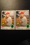
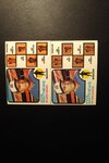
I would have liked to have seen Heritage incorporate some of the error/corrected peculiarities like these 2:
IMG_20220324_0823273.jpgIMG_20220324_0818251.jpg
A bunch of the managers cards have 2 shades of backgrounds behind the coaches, one lighter than the other. And a few players have a number of "broken borders" like Buddy Bell's card with a notch in the black border on the right side of the left card. Gates Brown is another guy with some broken borders in the set.

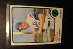
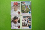
Willie Mays last individual card as a player (Clemente too) and Mike Schmidt RC are highlights (would like for mine to be in a bit better condition, but better than the one I had as a kid when I crossed out Ron Cey in black marker!).
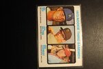
IMG_20220324_0829472.jpgIMG_20220324_0825160.jpg

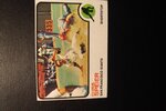
Of course, some action photos (that's Thurman Munson making an appearance with Terry Crowley)
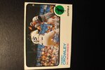
IMG_20220324_0824590.jpg
And my favorite - love those cars in the background
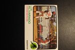
IMG_20220324_0830051.jpg
Where the heck was that photo taken?
 

Attachments

  • IMG_20220324_0829472.jpg
    IMG_20220324_0829472.jpg
    57.5 KB · Views: 1
  • IMG_20220324_0824590.jpg
    IMG_20220324_0824590.jpg
    60 KB · Views: 1
  • IMG_20220324_0825160.jpg
    IMG_20220324_0825160.jpg
    57.1 KB · Views: 1
  • IMG_20220324_0824590.jpg
    IMG_20220324_0824590.jpg
    60 KB · Views: 1
  • IMG_20220324_0824295.jpg
    IMG_20220324_0824295.jpg
    58.6 KB · Views: 1
Last edited:
I like this thread. It'd be neat to see some of the older cards side by side with some of the new ones.

Also, I'd agree that it would've been super cool to see some of those errors and/or mis-prints in the new cards too. Those little things are what makes the set what it is, especially for set collectors, and the fact that it was left out seems a bit like an oversight to me.
 
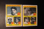
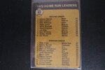
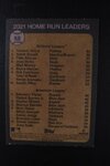
Comparison of card #1 in 1973 set and 2022 Heritage set. Interesting that the original is All Time HR Leaders and the 2022 card is Active HR Leaders.

IMG_20220324_1105142.jpg
 
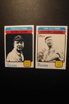
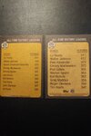
Here is Card #477 from 73 set and #472 from 2022 Heritage. When @grapler135s Mike pulled this card in one of the breaks in which I had Boston and said the card was going to me, I was surprised because I didn't think Cy was pictured as a Red Sox in the original 73 card. Indeed he is pictured with Cleveland in the 73 set and with Boston in the 2022 Heritage set. Glad to have this card so Thanks, Mike.

That 511 career win mark is surely safe for a long time. As seen on the back, only 2 guys have gotten into the top 10 in last 60 years - Greg Maddux and Roger Clemens and they are still 150 wins shy of Cy's.
IMG_20220324_1432430.jpgIMG_20220324_1433235.jpg
 
That 511 career win mark is surely safe for a long time. As seen on the back, only 2 guys have gotten into the top 10 in last 60 years - Greg Maddux and Roger Clemens and they are still 150 wins shy of Cy's.

Awesome to see these cards side by side. It's pretty neat to see those names so un-changed throughout the years. Pretty cool how they changed the picture on this card, too, instead of doing what is basically a reprint. Thanks for sharing, for sure!
 
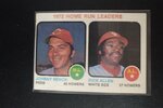
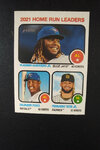
1973 was the first year Topps put the AL and NL HR Leaders on the same card. In earlier years (from 1961 to 1972), there were separate cards for the AL leaders and NL leaders. 2022 Heritage does the same thing.
IMG_20220325_1258288.jpg IMG_20220325_1253037.jpg

Dick Allen's 37 homers wouldn't even have made the top 10 in the AL in 2021. It wasn't easy to get 20 homers in a year back then.
IMG_20220325_1259023.jpg IMG_20220325_1253328.jpg
 
I thought I'd share another detail from the 73 Topps set which they carried over to the 2022 Heritage set. Each position has its own unique silhouette on the bottom right of the card. What I like the most about it is that right-handed pitchers and left-handed pitchers are treated differently. Right-handed pitchers have a red circle behind a right-handed thrower while left-handed pitchers have a blue circle behind a left-handed thrower. It's a nice distinction I haven't seen in other sets.

IMG_20220412_1226008.jpg
I wish I took a photo of cards showing the right-handed pitchers actually throwing like the left-handers Scarce and Hill, but Lonborg and Senzatela are both righties, so have the red circle and right throwing silhouette.
 
I thought I'd share another detail from the 73 Topps set which they carried over to the 2022 Heritage set. Each position has its own unique silhouette on the bottom right of the card. What I like the most about it is that right-handed pitchers and left-handed pitchers are treated differently. Right-handed pitchers have a red circle behind a right-handed thrower while left-handed pitchers have a blue circle behind a left-handed thrower. It's a nice distinction I haven't seen in other sets.

View attachment 6668
I wish I took a photo of cards showing the right-handed pitchers actually throwing like the left-handers Scarce and Hill, but Lonborg and Senzatela are both righties, so have the red circle and right throwing silhouette.
That is a really cool detail that I never knew. Awesome that they carried it over to the 2022 set. Thanks for sharing Larry!

Mike
 
Awesome, I never noticed that before. I agree, too, that it would've been better to see the pitchers throwing in the photos. In fact, I think all cards should include action shots instead of posed shots. Even the Mac Scarce card looks a little silly, even though it's still more creative than the two right-handed player cards.
 
Wonder if those posed shots were done for the 2022 set to match the ones used for the 1973 set too…if they were then hats off to that attention to detail!
 
Lots of interesting information. Some cool comparisons. I think on the Cy Young the team change was intentional, so people did not try to pass them off at the 73s. I am sure someone will though. LOL :) I noticed the pitcher thing, but never paid any attention to how the design showed them. That is kind of cool, would be neat to see something like that on the hockey cards, or maybe I just never noticed it.
 
If I remember correctly, the Lonborg was a retouch job because he pitched for Milwaukee the year before..........Topps probably didn't want to do the whole uniform, pre PhotoShop and all.........
 
If I remember correctly, the Lonborg was a retouch job because he pitched for Milwaukee the year before..........Topps probably didn't want to do the whole uniform, pre PhotoShop and all.........
I think you are definitely right about that. There is a weird dark halo around the edges of the red on the hat. Lots of these 73s have touch-ups, not sure how much of that is still done in 2022 cards.
 
Back
Top